Have you been there before?
First, you build a website, start blogging, or spend a ton of money on social media ads…
Next, you create a popup or direct people to your opt-in page…
And then… crickets… nothing.
This is often the case when you're just starting. But don't worry! I'm going to share with you a few tips on crafting crazy-converting landing pages that turn your website visitors into leads and sales.
Your opt-in page (also known as a landing page or squeeze page) is arguably the most important page on your website.
Those “optins,” and the optin emails you send your leads, start the customer journey and help you build your most valuable asset — your email list.
Your opt-in page will turn otherwise lazy web visitors into the people you ultimately want — customers. It will set the tone for how you'll handle all future transactions with your leads and customers.
Therefore, it is vital to do it right. You need to know how to create an opt-in page that turns your site visitors into email subscribers. So let's do it!
But First — Check Out These Landing Page Examples That Have Generated Millions.
You won't believe how simple some of these opt-in forms and landing pages can be.
1. Double Your Dating Landing Page by David D’Angelo
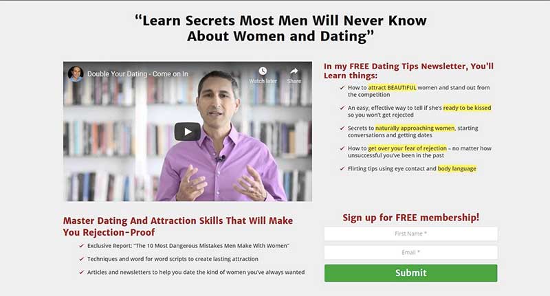
Back in 2004, Eben Pagan, who went by the name David D'Angelo, came up with this fantastic landing page. It generated about $20,000,000 for him with this very opt-in form at the very top of his digital marketing sales funnel.
As you can see, the landing page is clean and simple — white on white with a box around it. He included a red-colored headline with a hook that previewed what the visitors would gain from his informational product.
It includes six bullet points offering additional insight into his headline and ends with an invitation and a call to action.
What I like about this landing page is how spot-on everything is — from the design to the email opt-in language, to the bullets he used.
Short, sweet, and effective. Even though this opt-in is a bit older, this incredibly simple design still works for people today.
2. Motley Fool’s Opt-In Page
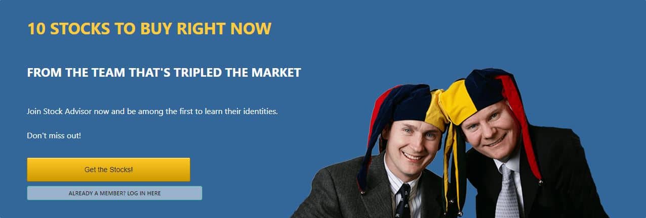
The Motley Fool is another landing page I like that’s still currently running. This is a financial newsletter offered by this multi-million-dollar business, and you’ll notice that, again, this one is really simple.
They’re giving away a guide for investors who want to know how to pick the best profiting stocks.
The way the headline is worded is brilliant, making people not only curious about those stocks but adding the fear of missing the boat when they look back five years from now.
Remember this…
The fear of loss is always greater than the desire for gain.
The headline gives a very specific amount of time when they can expect to see their ROI. The opt-in design is simple and crisp, with the brand at the top and the FOMO (fear of missing out) verbalized three different times in different variations.
This proves that landing pages don't need to be fancy, with tons of social proof and social media links all over the place. They gave one promise with one goal and it's working like crazy.
3. Mike Dillard’s Free Training Opt-In
Mike Dillard has made a considerable name for himself through his mind-blowing webinars and books, which has earned him the right to have his image on the front of his opt-in page.
I’ve studied his older book for quite some time and had the privilege of having my business used as a mini case study (I believe in his webinar.) Because of simple landing pages like this one, he’s racking up millions of dollars from his online business, with hundreds of thousands of subscribers on his email list.
This landing page works because it’s as direct and specific as you can get. His opt-in page has a catchy headline that tells you what you’re going to get, scratching an itch Internet marketers have. It tells you when you can get on his next class and ends with a clear, concise CTA.
Keep things to the point…
At the bottom, you can see just how many people have liked this opt-in page on Facebook which gives that extra oomph by showing people that “Hey, Mike Dillard is the real deal.”
Now when you do click on the “Reserve My Seat,” a form comes up into which all the digital marketing funnel visitors enter their info.
This having to push the button before typing in their email address is a micro-commitment that is very powerful.
When they push the button, they are already in “buying” mode and are more likely to enter their information, since they have already started the process. They are already partially committed so they might as well finish it up and get access to the training.
This opt-in is what he’s currently running. Again, it’s really simple and works incredibly well for him.
4. Ryan Deiss' 5 Million Dollar Optin Page
I've been to Ryan Deiss’s live events and studied his training for a while now. He is Perry Belcher’s partner in this massive online business called digitalmarketer.com.
Ryan Deiss’s landing page has:
- A mere twelve words that pop out at you
- A CTA button
- And an image
Down below he included some legal jargon, and that’s about it.
This is one of the landing pages they’re currently running, and it’s crushing it. You won’t believe how a page that can’t get any simpler than this is earning them at least $5 million a year.
That's the power of it all…
Right off the bat, they have a call to action. Then they follow it up with exactly what the subscriber is going to get by entering their email and clicking on the Free Instant Access button.
They’re offering something exclusive that’s not available anywhere else, that's highly profitable, and people want in.
Landing pages don't need to have much. However, what IS THERE should convince people to move forward with the call to action.
How to Create a High-Converting Opt-In Page
A great opt-in page for the top of your digital marketing funnel has all these essential elements in place:
- Simple but concise words and eye-catching design
- A compelling, experience-yielding offer
- An attention-grabbing headline
- Copy that further clarifies your offer
- A clear call to action
Let’s talk now about the seven factors or elements of a killer landing page that can be at the top of your digital marketing funnel — earning you more subscribers, generating leads and growing revenue more than you've ever thought possible.
First: Simple and Clean Page Layout and Design
Forget flashy designs, crazy color scheme, gobs of social proof, and wild attempts to make your landing page look overly “professional.” Too many people make the mistake of wasting too much time and money focusing on the design.
I’m talking about a simple presentation on your squeeze pages. If someone is going to opt-in for a giveaway, then you only have about five seconds to persuade that visitor.
Don’t get hung up on making your landing page overly beautiful, flawless, and design-oriented. Instead, focus more on split testing the headline and getting your digital marketing funnel up fast to know if it's going to generate results.
Keep all landing pages simple and concise. Inform your visitors what they will gain in exchange for their email address.
Second: Clear and Concise Copy
Your words hold the power to persuade visitors to sign up after reading what you’re offering them.
It only takes them about 5-10 seconds to decide to stay or to go. So make every word count — keep it short!
The copy on your optin page must be absolutely clear about what your visitor will get and when they will get it.
Third: Customer-Focused Message — Fears and Desires
You're creating this landing page with a specific avatar in mind. So focus on that audience. Speak to them personally.
You want to spark a sense of curiosity in your reader. Make them want to learn more. Influence them to go to the next page by entering their details. Get them eager to access their free video, free eBook, or gift pages.
Be direct. Don't beat around the bush. Use spot-on, perfectly crafted opt-in language that will answer their whys, hows, and what's next after seeing and reading your landing page.
Fourth: Compelling Headline With a Benefit-Driven Hook

Arriving at your landing page doesn’t necessarily mean anyone is opting in. You need to capture their attention FAST, and you do that with a compelling headline.
The best headline for your opt-in page will:
- Be concise, straightforward, and on point
- Provide a specific and desirable benefit that solves your visitor’s problem
- Entice your reader to take ACTION
Think about value
Your headline is your opportunity to convince your audience of that value within the first line. What you’re offering will determine what style of headline you write.
Do you want to answer a specific question and fulfill a need? Do you want to inform or teach your audience something new? Or do you want to offer them an opportunity to try your new product?
Build your headline around those considerations. Additionally, your headline space can be the ideal spot to inform them that the offer you're giving away is free.
Use opt-in language that makes your headline stand out
See how incredibly simple these headlines are. They’re appealing — these attention-grabbing headlines work!
- “How to ____…”
- “Secrets behind ____ revealed…”
- “Discover the ____…”
A persuasive headline will appeal to your reader's curiosity, fear of missing out, and immediate concerns. These types of headlines are the ones that your audience won't be able to resist.
Fifth: Persuasive Copywriting That Reels Your Audience In
Below your headline, you have an even higher chance to hook your audience with your landing page wording. Your copy should include more detailed information as to what your audience can expect by taking you up on your offer.
Supporting Details with Copy
Your opt-in page can include one or all of these elements:
- The kind of product you're offering
- When they can expect to see results
- What they will miss out on if they pass
- When they can access the information or product
- What value you are offering them — what they will be learning
- A call to action
These points are relatively simple, but again, your choice of words is critical.
This is your chance to follow up on your headline with just enough opt-in text to satisfy their emotional need. Give your audience a preview of what they'll gain access to after the email opt-in.
Sixth: Irresistible Offer and Strong, Clear Call to Action

Landing pages are an introduction to your brand and will create the entrance to your digital marketing funnel. Opt-in marketing is all about giving your visitors something more valuable than holding on to their email address.
A simple but deep and very impactful benefit for your business.
There’s a little over 1,700 words and a how-to video about this opt-in offer strategy on How To Create A High Converting Lead Magnet (another marketing word for an opt-in offer).
What you offer at the top of your digital marketing funnel doesn't need to be the most valuable asset you have.
The Double Your Dating page example only gave away a half-page of text with one impactful tip.
Lead Magnets that Win
What sets apart a winning offer from a losing one is the experience you give to your audience in your lead magnet.
Whether your offer is a video, webinar, downloadable content (a PDF), or free mini-course enrollment, be sure you’re giving them something exclusive and can't be found elsewhere on your site. Aim to create something that fixes a problem your audience has.
Another thing to keep in mind is that even though other people are in your niche and possibly even featuring products with a similar theme, do not let that stop you!
It may be easier to create something similar rather than doing 100% of the work from scratch.
Be authentically you and put aside the saturation myth. You are the only person that can present the information in your voice. Furthermore, visitors crave authenticity.
This is worth repeating — BE SURE you have a call to action! We're not doing branding here. This is direct marketing!
Seventh: Execution — Build Your Opt-In Page Today!

The most important thing is to keep your landing pages clean and simple. Again, forget about social media account links or cluttering up your page with other social proof.
Less is more here.
There’s no need to try to make it overly beautiful and over the top. Don’t get too hung up on wasting time and energy trying to make it look perfect. Focus more on the marketing opt-in language and making sure it's on point and concise.
When building the best opt-in page, Thrive Themes on WordPress will save you tons of money. It has the best landing page builder and has way more efficient split testing than when you just use Google Analytics.
A “launch-fast-and-adapt” formula is critical because the only way to truly know if your opt-in page is going to work is with real traffic.
Now you know their secrets!
12 (Other) Great Opt In Page Examples
Below are other high-converting landing pages and opt-in pages that you can mimic and browse through for ideas:
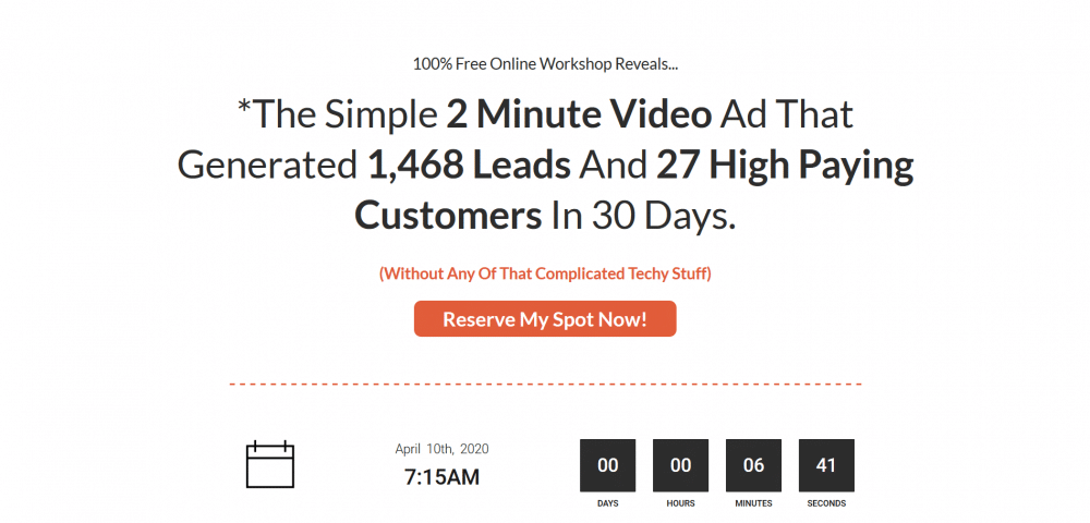
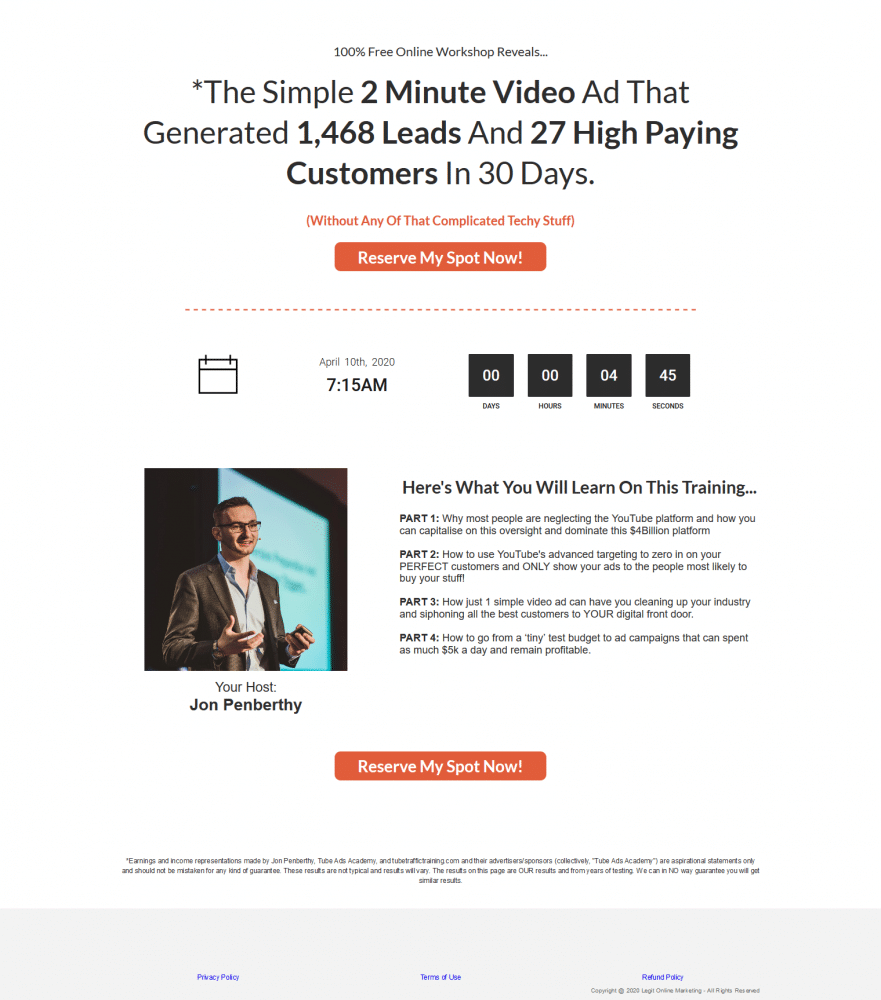
Here is a webinar registration page that is very similar to my main template with a couple of small tweaks…
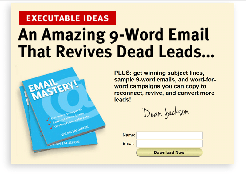
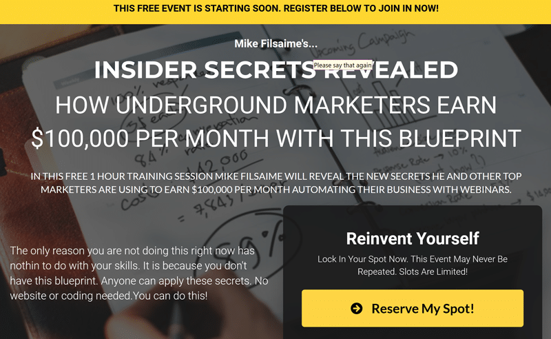
This is one of Dean Jackson's opt-in pages. It converts over 60%. He teaches the ‘9-Word Email' in the ad itself. This is for people who want to get more subject lines, templates, and more email campaigns. He does a great job of ‘pre-framing' them before he ever makes his offer… But again… SUPER SIMPLE!
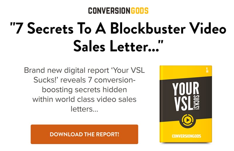
There are a couple of things I don't love about this landing page. But to be honest, Mike is a very smart marketer, so he has probably tested it. I don't love the busy image in the background. I believe that it competes with the text and makes it more difficult to read than it needs to be. I also don't love that the button color matches the upper header color. Honestly, tweaking those things may not increase conversion rates. He possibly tested this version as the winner.
Two-Step Optin Pages
This hook/angle is great… Callout at the beginning to make entrepreneurs think “Ah, this is for me!” and the ‘mistakes' angle stirs up the viewer's fear of loss… only two bullets — they aren't super strong… not sure about that image. Lots of testing potential though, for sure…
Here is another super simple landing page that works like CRAZY for a seven-figure business owner who does a lot of split testing…
Here's the template he likes to use (variations of this headline are in our headline tool, FOR SURE!)
Free [Thing] reveals the [simple secret] that [created desired results] in [specific time] without [biggest frustration]
This is the view you see when the page loads:
And here is the full page if you scroll down…
He effectively added four bullet points that explain the four key things you will learn inside…
If the headline and hook above didn't get them to click the button immediately, this is his way of pushing them over the edge to join in. These are the most common objections and/or biggest problems he hears from his audience members and he's making sure they know that they're going to learn what they need…
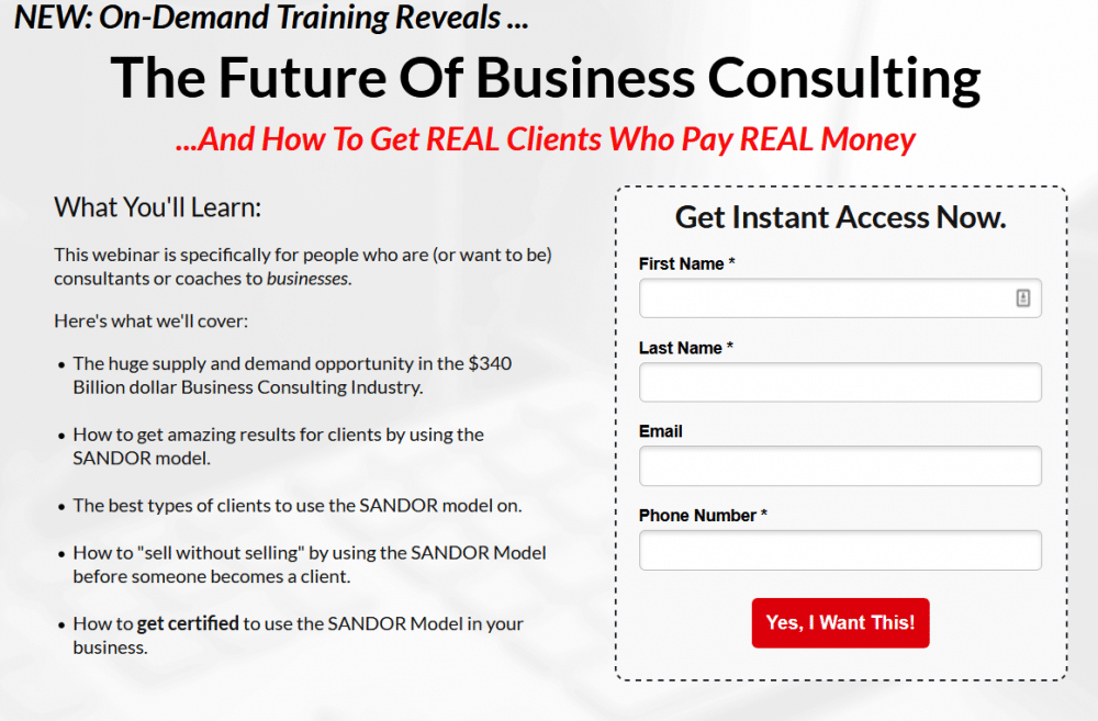
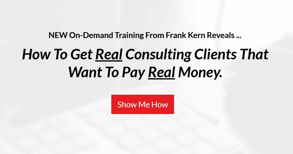
Two from Frank Kern… I think these are running as a split test.
This first one has a LOT more benefits via the bullets and I don't love how it asks for SOOOOOOOO much information right upfront… But this is for a very expensive product, I think $12k or so…
New? The FUTURE? Curiosity inducing for sure… But this is all hinging around the simple “How To” headline.
And it is a variation on the ‘how to get [desired result] without [biggest frustration] headline template.
Optin Forms
And then there is a variation that has WAY less text, goes more for curiosity and does request the same info after clicking the button…
This one is all in on that ‘how to' headline.
Simple stuff… But super effective. He is quite smart, and I can only imagine there's been a LOT of testing to create these two optin form variations.
Here's another I found buried in an old swipe file I had saved to a hard drive years ago… I think it illustrates that what ‘works' when it comes to opt-in pages hasn't changed all that much.
I'd go with a CTA button instead of the name/email field… but that headline though!!!!
It is ALL about the headline here… In about 20 words, this can establish WHO it is for, WHAT specific problem it solves and promises the DESIRED RESULT…
All wrapped up in one big secret.
Powerful.
Keep the whole page clean and simple. Use words that compel action. Provide your audience with something of value. Make them an offer they simply can't refuse!
Also, if you're serious about growing an online business and changing your life for good, then you should check out my free course that reveals the 7-step process that took me from $50,000 in student loan debt to a million-dollar business online.