

What's the most successful way to craft a landing page?
But you don't want just ANY landing page - you want one that converts traffic into buyers!
I'm about to show 18 high converting landing pages and how you can find 100's of niche and product-specific landing pages examples - for free.
Furthermore, you'll also discover what's working now - not what was working 3 years ago, but landing page layouts and page design that will help you craft great landing pages today.
Let's get started...
How To Find 100's Of Great Landing Pages
If you're not familiar with Clickbank you need to learn how to read Clickbank metrics now.
To find hot landing pages that are converting right now, you simply create a free Clickbank account, type in a product or choose a niche category, sort by gravity score and bam!
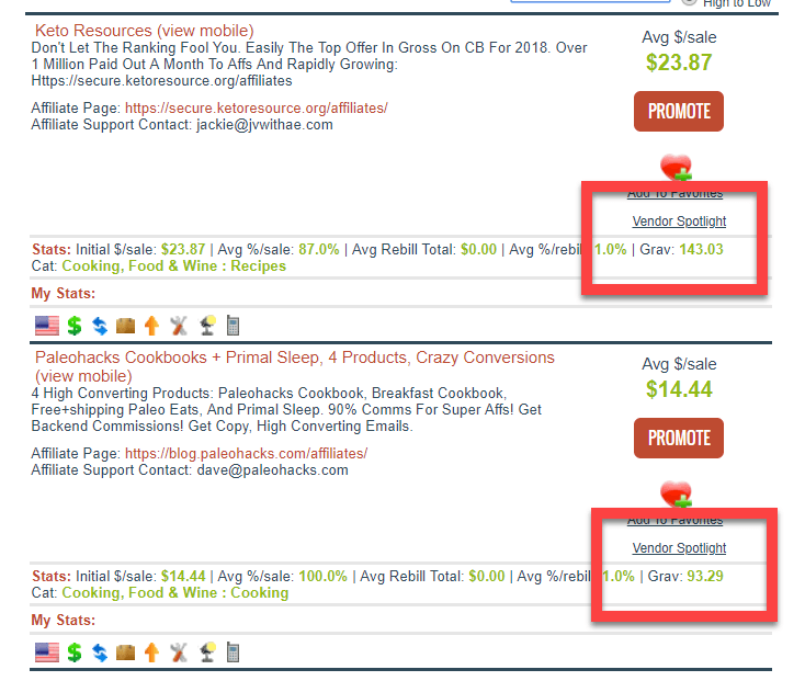
Gravity is simply a measure how well a product/landing page is performing in the past 4 months. Gravity is basically a score of how well a given landing page is doing and how likely someone is to take action.
To Boil It Down...
More or less, when you sort by gravity, you are getting a decent glimpse of conversion rates.
A plus 60ish gravity score is ridiculous!
I can now click and view the live page that is converting so well and reverse engineer it!
I chose 3 very different niches so you can pull tons of variety out of each of these sales pages.
Example # 1: Story First, Offer Later
Our first landing page example comes from https://fatdecimator.com/
From the very beginning, it is pretty much-screaming authority with the headline!
“Ex-Marine Reveals the ONE Veggie You Need to Stop Eating to Lose One Pound of Belly Fat Every 72 Hours.”
First of all, this is a powerful headline! One of the reasons for that is because it uses catchy key words: ex-marine, one veggie, loses one pound, and every 72 hours.
Let’s break it down a bit further, though. There are a lot of important components here that help this site to crush it. Let’s take a closer look.
"Ex-Marine" = Building Trust
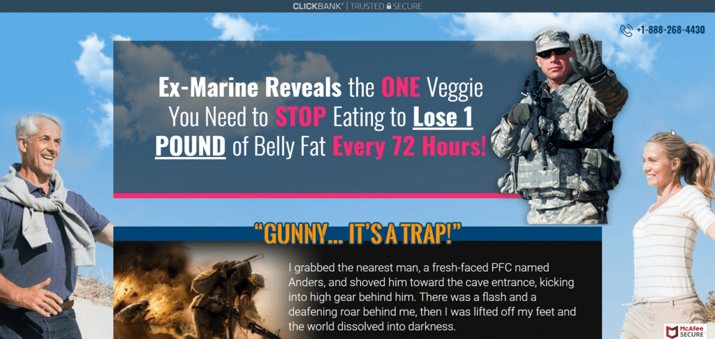
Right at the top of the page when you hear the words “ex-marine” or “marine,” you instantly think of concepts like power, authority, command, etc.
This allows visitors to relax a bit because there is an element of trust already baked in. You don't need to worry about how to convert visitors right away here. You just want to establish a bit of trust which makes it easier for your visitors to keep reading.
Then we see...
"Reveals"
Even the word ‘reveal’ seems to spell out something mysterious… like there is some kind of secret that everyone wants to know that will put them ahead of the curve.
This honorable Marine knows something that regular, poor civilians don’t understand. He has a secret. If he reveals it, you will have ‘special insider knowledge’ that could help you to solve your problem in an awesome way!
Everybody wants to know a secret. That’s why putting “reveals” in the headline instantly piques everyone’s curiosity and makes them want it.
Then Come Specifics
This headline is not just saying that they can help you lose weight. Instead, specifics are used… and specifics are critical on all of these landing page examples.
This landing page is using very specific numbers. These specifics give you an actual figure to visualize for yourself.
You think, "Can I really drop THAT much in THAT amount of time? "
It helps you to identify the value proposition, which makes it more appealing.
Make It Easy With Specifics...
They are also telling you about ONE specific veggie that you need to stop eating to make all of this weight loss a reality. This is part of the secret, but it is also very specific. People LOVE specifics like this, especially if they promise big results!
But losing one pound is also believable. People believe that this can happen, so it is also realistic.
Compel People to Think Further...
When they do the math, they are basically realizing that the offer promises to help them lose 2 to 3 pounds a week. That’s 10 pounds a month… all from just cutting out ONE veggie! This makes it easy. You should always seek to make it easy for your visitors.
That’s an awesome offer! It’s compelling! What website visitors wouldn’t want to know that?
Phone Number - Trust Factor #2
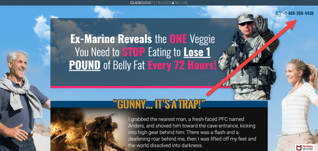
Another quick, yet powerful way to establish trust on your landing page is to include a legitimate phone number in the copy.
Visitors won't worry about when the page was last updated because that sort of contact information will make your visitors think there are a few people standing by to take there order at any time.
No Receptionist Needed...
Even if you only have a voice mail attached to this number it still allows visitors to reach out. Social media support via Twitter or Facebook is pretty lame compared to when you have a real phone number.
If you’re revealing a tip, secret, hack, or plan to your audience, you need to be sure to prove to them that they can trust you.
After all...
How can you claim to be a legitimate business if you won’t even give out a phone number?
The more contact information you can display on your landing page without diverting your visitors attention the more information their brains will see as silent cues they can trust you. Even your email address can help people. An email address let's people know you're real when a phone number won't work.
Color
Now let’s talk about your color scheme! This landing page features a combination of pink, sky blue, and white colors. These colors are light. They’re delicate. They’re almost feminine.
The seller is obviously targeting a female population on this page, and color choice plays into this a lot. For best practices, you'll want to choose your colors based on who your target audience is.
Pick Targeted Color Schemes...
You can have the best value proposition in the whole world, but if the colors are terrible to where you can barely read the copy, then that conversion rate is going to suffer.
You want your target audience to feel like this is a perfect offer for them… and colors can help to do that!
Trust Factor #3 - Says again Who and Why They Can Help
Your customers are going to want to know why they should trust you, and rightfully so.
So you have to communicate this in your landing page content.
Why should they buy your stuff? Do you have a P.h.D or a Master’s Degree? Do you have some kind of award or certification? Where is the proof that you are the best person to help them solve their problem?
State Your Credentials...
The best landing page design examples will have some type of reference to your credentials. Best practices would be to display this information for visitors sooner rather than later.
Does your product use credible evidence to back it up? Has it been mentioned on credible websites? Has it been recommended by people in your niche?
How long have you been an expert? What is your level of expertise? What makes you better than the next person who happens to be selling a similar thing?
Show You Know What You're Talking About!
This is a common thread you'll see in the landing page examples we're discussing. in this case, the seller is an ex-marine who has been in the industry for YEARS.
He is also telling, showing, and sharing how his formula has literally helped hundreds of people with their problem.
Everyone knows that an ex-marine is going to mean business. Everyone knows that an ex-marine isn’t going to want to ‘mess around’ with formulas that don’t work.
This is where the credibility comes in. Your visitors know that marines are trustworthy, reliable, elite, highly trained, etc.
So in your case, you need to let your visitors know who you are. You need to tell them why you can help, why they can trust you to help, and why your work should matter to them.
Imagery
This page got both the content and the imagery right. The headline is magnificent, for many reasons. But then, awesome imagery supports it and helps to drive it home.
There is even imagery of a blast, and all kinds of awesome graphic work!
Get Serious About Graphics
When you scroll down the page, there are literally dozens of before and after pictures. These are pictures of actual buyers. There is also the ex-marine image toward the top.
All of this helps to convince visitors to trust him. It tells them that this marine gunnery sergeant has discovered the secret to losing weight (1 pound every 72 hours) by avoiding eating just one specific veggie!
If you are just getting started then you think, "oh I can cut out just one veggie". You always want to create an easy path for your visitors to get started.
Then It Continues...
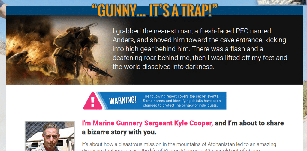
“I grabbed the nearest men, a fresh face, a PFC named Anders, and shoved him towards the cave entrance...”
Here, you see content that is exciting and dynamic. There is an image of a blast, plus pictures of a marine in a combat situation, lots of emotion from the imagery. But then, it switches gears a bit.
“Hi, I’m Sergeant Kyle Cooper, and I’m about to share a bizarre story…”
And here, we hear mention of a bizarre story. Customers love this. They love mysteries, hidden facts, and weird, secret knowledge.
Craft Intriguing Copy
Then, he goes on to talk about how he helped someone lose over 40 pounds, and saved her life in the process! There are also these images of before and after pictures… all setting the stage for the sale.
It all looks easy. It is all right there. There is a ton of proof, trust, and curiosity already created. The storytelling has helped to build trust and believability.
You can probably already see why this landing page has been so successful!
Powerful Bullets
The sales page also goes on to talk about what is NOT required to succeed with this system. When it comes to dropping a few inches from their mid line, people tend to have a few hesitations and objections. They visualize gut-wrenching workouts, getting surgery, taking unhealthy pills, etc.
But the great thing about this landing page design is that it spells out, in bullet points, exactly what you DON’T have to do! It deals with all of the common objections coming right out of the gate. No tough workouts, no fad diets, no pills, no surgery, etc.
Think About The "Nots"
Great landing page design examples will often have a small section of what NOT to do... Or why you should NOT buy the product. It seems counter intuitive, but it builds trust in your visitors.
And then, alongside these bullets, the page goes on to continue building the story of the author’s success. You can’t even see the actual offer yet! You still have to scroll at this point.
It goes into giving more testimonials, more stories, and more case-building content. All of this really gets the visitor thinking that they might actually ‘miss out’ if they don’t jump on the offer!
About the Length...
It’s actually a super-long landing page when you consider everything. But it is packed with stories and awesome content, and that’s what you want. Your page doesn’t have to be this long, but the point of all of this is that conversions will increase if you can successfully help your readers to visualize what is really in it for them!
Once you can convince them that they would win with this offer, you move on to talk about the actual offer.
Of course, don’t forget about the intro! The intro is everything! Without a good intro, they will click away before you’re even able to build trust.
So just to recap, let’s talk about some of the elements he has used to build trust here.
- He’s a marine gunnery sergeant
- He saved Sharon’s life by helping her to lose over 40 pounds
- He found the secret to weight loss in the unforgiving desert
- He deals with objections in bullet-point form
- He hooks you with the promise of secret knowledge
- He lists testimonials
The list goes on and on.
It is long, but the trust-building on this site is so good that people are literally trying to find the CTA so that they can get on to the next part!
It Doesn't Stop Here...
We’ve found some awesome takeaways from this landing page design, but let’s move on to a couple more great landing page design examples page and take a look at that one as well.
This one is a little different, but it will also teach us some valuable lessons.
Example # 2: From Zero to Hero
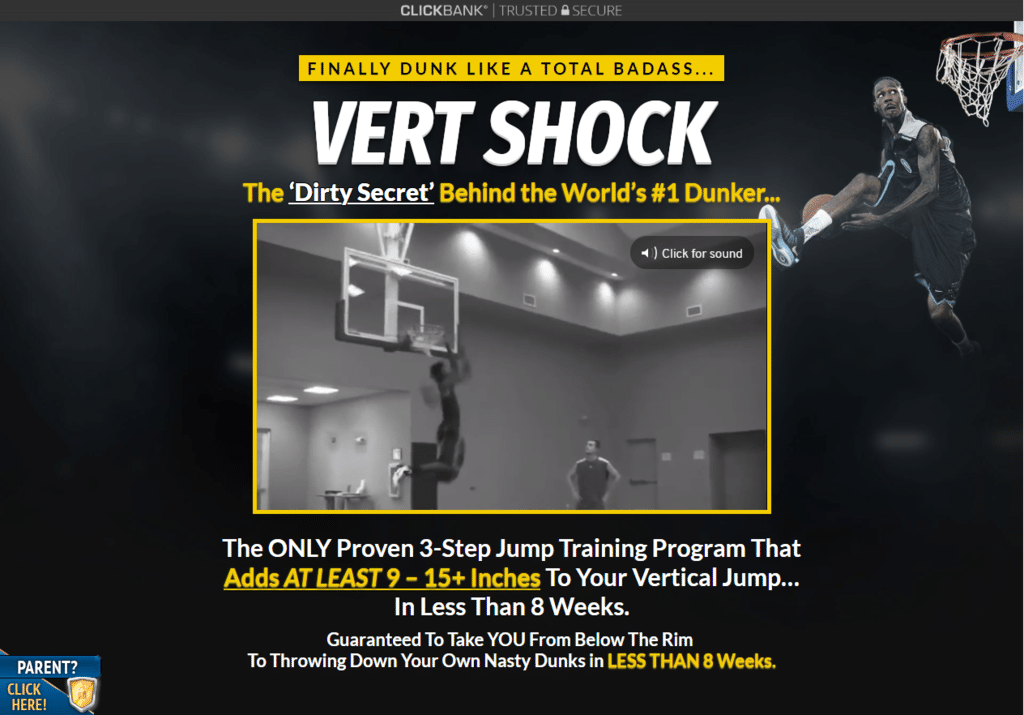
Here's one of our landing page examples that's quite different. This is a product that aims to help people jump higher. It claims to help them ‘dunk like a total badass.’
This is an awesome landing page for several different reasons.
Why? Because it has everything proper landing page examples should have. Everything about it just works.
Let’s take a closer look.
Keen Choice of Colors
Right away, you will see that the difference between how this page looks and how the first one looked is literally as different as day and night!
Color-wise, you will see that that this page has a lot more black, yellow, and white in it.
The fatdecimator landing page leaned more toward a female audience, which explains why it had so many light blues, pinks, and whites in it.
But the Vert Shock landing page takes an entirely different approach. This page has an unmistakably masculine vibe to it.
What Color Pallet Reflects The Emotions Of Your Audience?
You can almost smell a dude’s gym bag in the picture, and it almost makes you feel like you want to get to the gym and slam some basketballs with your boys when you look at it!
It literally evokes these desires and emotions, which is powerful!
This page is full of ‘man’ stuff, and the color scheme is the first thing we notice that gives us a direct hint as to who the landing page design was created for. It is for amateur, inspired, hard-working basketball players who want to take their game to the next level.
It immediately connects with visitors who are normal everyday basketball players that want to consistently spring up and slam-dunk… one right after the other!
Powerful Use of Imagery
As we’ve already mentioned, the colors are quite different in this on from the other landing pages. We’ve also noticed that one is ‘girlier,’ and one is ‘manlier.’
But despite these obvious differences, there is still a common denominator between the two.
Both landing page examples use powerful imagery to appeal to their target audiences. In this page, it happens to be this cool guy dunking a basketball, along with a video in the center of the page showing dunk, after dunk, after dunk!
Imagery is powerful. But it is important to get it right!
Dirty Little Secret Revealed
This may seem like an overused line sometimes, especially in landing pages. But hey… it’s used because it WORKS!
If you want to capture people’s attention right away, add these two powerful words to your landing page headline.
- Secret
- Revealed
In this page, for example, they’ve got the headline:
“The Dirty Secret Behind the World’s #1 Dunker…”
If you’re a dunk-obsessed dude who has been trying your entire life to dunk, only to fall short every time you’ve tried, this headline would definitely make you curious enough to take action.
Tease Your Readers!
You’ll want to know what the secret is! You’ll want to know if it could work for you. What if this secret could finally help you dunk the basketball? It's no wonder this page has a high conversion rate.
As you scroll down further, you will find that there is another ‘juicy’ element to this secret. There is the feeling that you will ‘miss out’ if you don’t know what the secret is.
It’s like the secret is right within your grasp. If you could just uncover it, you would level up your abilities!
And as you read more, you will hear stories that will build up your interest.
Your desire to know the dunk-king’s secret will grow. You’ll start to wonder how fast this secret would work for you!
That leads us to the next part of these landing page examples…
Specific Results
You start off with a “secret to ____ revealed” hook, then you follow it up with the specifics, actual numbers, and/or the specific length of time it’ll take to see results.
In the first landing page we looked at, they promised to help you lose 1 pound every 72 hours. Boom. This tells you exactly what they are offering and how fast it could work for you.
But this ‘dunk-master’ page also has specifics!
What's The Promise?
They offer a three-step dunk training program, which promises to add “9 to 15 inches” to your jump IN LESS THAN 8 WEEKS!
Even if a player has a game coming up in just 3 months, they could still use this training program to level up their dunk-game in time to make it!
PLUS...
The description also gets you thinking that the program won’t be that hard. There are only three steps to it, after all. How hard could that be?
You could be the next ‘dunk king’ of your own court in just 2 months!
How? By learning from the dunk-master himself!
This is a great landing page in this regard, because it does a fantastic job of appealing to people’s love for specifics. People want to know exactly what they’re getting! They want to know exactly what to expect from the program, and they want to know how long it will take them to get results.
Give Details...
A page without specifics comes across bland and vague. Provide social proof in your testimonials of exact numbers and moments! This is when you can use your social media platforms to pull from. Socaical proof is very powerful so don't thins
So your job is to tell them what it really takes, and also how long they will have to train to fly from zero to hero. And if your offer is compelling, it will sell!
Testimonial After Testimonial In Landing Page Examples
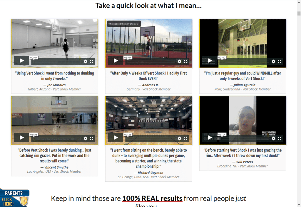
It is pretty much guaranteed that people are not going to take you for your word at first. They are going to roll their eyes, and are definitely going to want social proof before they buy anything.
So in order to give them the social proof they need, you’re going to take them deeper and deeper into your story. You’ll also need to show them the testimonials on your landing page that prove who you are and why you can help them.
This landing page design above really rocks because it has the same story pattern as our first example. It speaks to a lot of objections people might have, and counters them quickly.
A page without testimonials looks like you just launched your product. You'll have a tough time trying to convert visitors if you can't show at least SOME type of social proof.
Show Them Proof!
You want to present potential buyers with dozens of case studies, personal experiences, and/or results from actual customers. This is awesome because it shows them what happens when real people use the program!
There are also pictures of individuals who went from ‘zero to hero’ on this site, doing dunks after dunks… proving that the method works and that it is not just ‘smoke and mirrors.’ The more information you can give visitors in the form of social proof the better.
This page even combines written testimonials with video testimonials, which is outstanding!
Don’t just offer promises and talk. Show your readers what’s in it for them. Show them proof that it works. They simply won’t buy it if they don’t believe 100% that it could work for them.
Building Credibility On Your Landing Page
Do you remember the ex-marine guy from the first of our landing page examples? This page is also similar to that one in that they really build-up the credibility of the person offering the product before asking you to accept the offer.
First on this landing page, they tell you that there are ‘deep secrets’ behind this man’s ability as the #1 dunker.
Second, they build him up by telling you what he has done and how awesome he is on the court. And third, they tell you how he’s the number one dunker on a TV show called the Dunk King, and talk about how he won the Nike World Dunk Competition.
Then It Goes One Step Further!
There is even a picture of him with Lebron James to connect him to fans of the NBA!
But the point of all of this is that they build up his credibility by laying out his qualifications, credentials, and the things he has accomplished that are relevant to the program he created.
This is the guy that everyone looks up to, and now he’s teaching people to jump just as high as he does…
And it’s all a matter of following exactly what he did. He teaches you how... in this three-step training program.
Keep doing what he tells you, and in roughly 8 weeks or less, you can add up to 15 inches to your jump and start dunking that basketball!
Flood Them With Relevant Details!
Again, the more information the better. Give specific examples and results via social proof and it will really help to cultivate great landing page design.
What’s Not Required: Objections
Most people are not going to believe everything. They are probably going to have at least some questions and objections along the way.
This is why winning landing pages make it a point to reassure customers by dealing with the main, common-sense objections head-on and in a very direct way.
Address Things Head-On
You have to eliminate these doubts from their mind… and you do this by adding in bullet-points or some kind of a list that basically tells them what they won’t have to do to make it work!
The previous landing page told us that we wouldn’t need fat-burning pills, surgery, or to do painfully hard exercises.
The testimonials also backed up these claims.
One cool thing about this dunking website is that it speaks to a lot of the objections right away.
You’re unathletic? Not a problem!
You’re not even 6-foot tall? Screw that. You can still totally dunk like crazy!
You tried other dunking training programs before and failed? You may have gotten a lemon last time, but this one is a sure winner!
And Most Importantly...
You CAN dunk. Yes, they even had that design part highlighted in bright yellow to boost your confidence and to help you build belief in yourself.
It’s telling you that you can be that dunking badass on your basketball team... EVEN IF you’re under 6-foot tall, unathletic, and have tried everything else in the past without results.
And the page just goes into story after story after story, where customers keep talking about how well it actually works.
And it does the trick! All of this confidence-building pays off with high conversion rates!
The Power of Visualization Through Your Story
Your offer is not going to convince people to buy your stuff right away.
Your offer is what causes them to gravitate toward pulling out that credit card to make the purchase. The moment when they hit that almighty CTA (call to action) button.
The real selling tool is your story. It is the angles you lead them to, the objections you address, and the building-up of confidence that comes with excellent and well-crafted content. Having a strong CTA won't matter if you didn't invest the time from the top of the page all the way down to the form fields where they enter their information.
Keep Digging For the Right One...
It’s easy to find high-converting products. But the real test is this… can you sell those products through the power of well-written copy?
That’s why you need your customer’s visualization skills working throughout their visit.
You begin with a catchy headline that promises the visitors secret knowledge… you promise them that this secret can solve their problem… you tell them that you’re going to reveal it to them, but first you throw story after story on the table, showing them how awesome and legitimate it is!
You debunk myths and offer testimonial after testimonial, each time providing even more reassurance that this secret is the answer they’ve been looking for.
They need to picture it...
You get them to imagine and visualize what it would be like to have everything you promised. They think about the specific results, and calculate how long it would take them to succeed.
You answer the whys, the hows, and the what-ifs, and make it 100% clear that your offer is the ONLY THING that will get them from point A to point B!
Weave your story...
Include a credible, reputable figure in it… like the ex-marine or the world’s #1 dunker.
Make sure on your landing page they know that you’re not some random kid trying to sell them junk. Make sure they know that you ARE somebody… that you have credentials and experience, and that you are a professional. Give examples of other successes via social proof.
Rock your story out with all of the necessary elements. You need imagery, colors, testimonials, credibility, specific results, and answers for objections.
This is how you create a baller landing page!
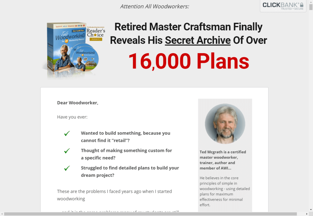
Example # 3: Secret Revealed
This one is really, really simple.
It’s for tedswoodworking.com, and it clearly specifies who the page is all about with the call out up top “Attention: All Woodworkers”.
Now let’s talk about the headline of this landing page and why this one rocks it out in this niche.
Credentials and Hard Sell Revealed Immediately
This guy keeps things clean and simple. He tells you right away who he is and why you should buy his stuff. Some of the best landing pages are descriptively clean and simple. And you’ll notice that the first three words instantly give him all kinds of authority.
Retired Master Craftsman.
This guy isn’t just some ‘new kid’ on the block. He let's the visitors know he’s a retired master craftsman who has been in the woodworking game for decades.
Show Expertise!
They’re pegging him as one of the best. He could be THE best in the industry.
He’s definitely not your average craftsman who just wants to make money selling a course.
We also learn that he’s retired, meaning that he’s probably got it made. He’s trying not to work too hard anymore, because he’s already done that for years.
He's a master...
He’s just a highly-skilled master craftsman (almost like a grandpa) who is now spending his days teaching people how to do woodworking the right way.
Great landing pages that pull people in with targeted information like this are vital before the visitors see any type of CTA button.
Be An Educator...
He’s teaching people the best skills for woodworking, both for people who want to do it as a personal hobby and for people who want to go on to make it a business.
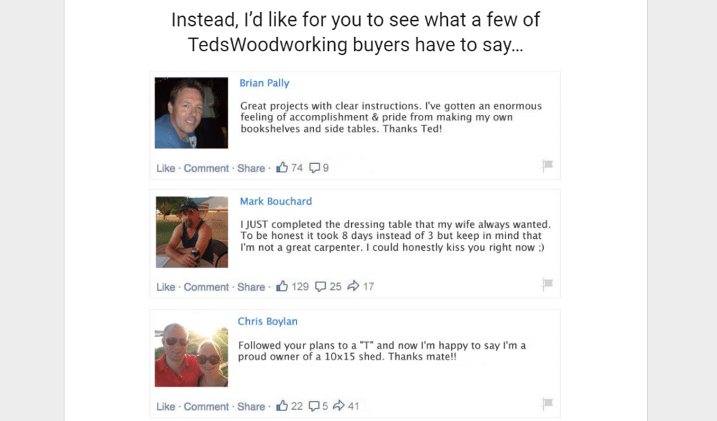
As you can see, credibility and trust are built almost instantly. You also notice that it doesn’t beat around the bush. The page quickly tells you that he’s here to reveal his ‘secret archive of over 16,000 plans.’
And boom. Just like that, you know exactly what he’s selling. You know that a master craftsman is offering the secrets of his knowledge, and you know that if you are interested in woodworking, this is an offer that will help you.
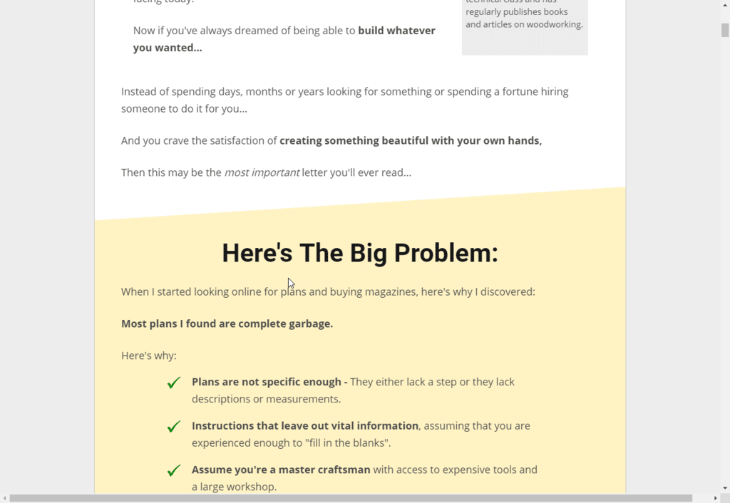
Clarifying and Eliminating Objections With Questions
This page also helps to address objections. And as you can see, they go straight into it with check-mark bullet points.
And you will notice that they deal with objections by turning them into questions.
Have you ever wanted to build something….?
Boom. There’s a green checkmark for that one.
And there are two more questions answered with checkmarks, which means these desires and objections are going to be met if you take his course.
He talks about the typical problems that woodworkers face. But he also provides answers to these problems through the course. This is how you get your readers on the ‘same page’ as you. It’s how you identify with them on your landing page.
You must know what your visitors desire. You also have to know what their problems are, and you must enumerate these down, assure them that you are eliminating concerns, and answer their questions as you are giving them the CTA.
Give them this assurance up-front, and then proceed with the story! The best landing page isn't complete with out some sort of assurance.
He’s Just Like You… Except A Little More.
At this point, we know that this guy is super-awesome. He’s one heck of a retired craftsman, and he has a lot of knowledge to offer.
He started out with all kinds of problems and challenges… but has since worked past them, and is now ready to pass this knowledge and information on to you.
Meet The Visitors Where They Are...
He was frustrated by sub-par courses that made things look easier than they were, and was also tired of pictures that were nothing like the ‘real deal.’ He empathizes with the visitors as part of his landing page design.
So he, our friendly master craftsman, decided to solve all of these problems with his own course. And he is now offering us the best of the best!
And just like that...
Boom. He solved his own woodworking problems, and now he is going to help you solve yours as well!
Reviews Delayed - Product Announced Super Early on This One
The biggest difference between this page and the first two is that in this page they put off the reviews until after they announce the product.
They start right off by showing you exactly what you’re going to get. Bam… you get exact specifics, you see the offer, you see everything right away.
Be Flexible On your Landing Pages...
This is different than the ‘usual’ landing page layout. Usually, reviews and stories come first, followed by an offer. This page works, however, because empathy is still established early-on.
He puts himself in the ‘average woodworker’s shoes,’ and makes you believe that he has actually been there. He knows that it can be frustrating. He’s here to help you out.
So even though the reviews are located below the offer, this is still an effective landing page… because he used empathy, objection answers, credibility-building, and trust to build up the value of his course early-on.
The CTA Button In The Landing Page Examples
You may have to play around with where on the page you put your actual CTA button with all of the form fields for visitors to enter their credit card information.
The CTA is a massively important part of your landing page. How could visitors buy with out it?
Do you place the CTA before or after your social proof? Will your visitors get anxious and click away if you have it too soon? Or will your visitors be mad that they had to scroll all the way down for 5 minutes just to see your CTA?
As always, you'll need to test everything in your landing page design - especially CTA button placement.
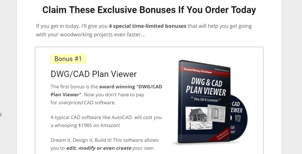
Exact Specifics of What You’re Going to Get
Without knowing right away how much it all costs, the page tells you everything that you can expect to get.
There are specific items listed, but there are also awesome visualizations to get you excited about what you could make if you actually bought it!
If you’re into woodworking, you can imagine how much anticipation this landing page creates. You can see that they’re really tapping into a passion for the workmanship here.
You might even find yourself thinking, “man, I want to order this!”
All of this leads to you believing that this is THE product you NEED to become an amazing woodworker.
The Power of Simple Check Marks
How long does it take for your readers to read through your content?
If it takes them several minutes to read through the content above the fold, you’ve already lost them.
It is vitally important that you keep things short and sweet! Don’t blab on. Be up-front, concise, and on-point.
Use simple checkmarks and bullet points to indicate your promises. By using simple bullets, you are not only giving your visitors concise information, but are also doing it in a format that is easy to read, easy to follow, and easy to understand.
The easier your landing page is to read, the better your conversions will be!
Color Choices - This One Keeps It Clean and Simple
A Simple Way to Upgrade Your Testimonials
But Wait…. There’s More! The Value Stack
Repeated Offer
It may seem redundant, but the secret to a REALLY powerful, effective sales page that generates serious cash is actually in what is called a ‘repeated offer.’
The idea here is that you don’t want to say things just once.
You want to keep repeating the offer, your guarantee, and even a few testimonials and bonuses. Along with these, you stick in a second and third “click to buy now” buttons.
The lesson here is that you really want to imprint on their mind that you understand their problem, are aware of their needs and desires, and that you’re addressing ALL OF THEM with this awesome offer!
This is your last hurrah before you close your copy, so make every word, image, and testimony count!
Catchy Headline
Appeal to people’s curiosity by offering them secret knowledge, and then promising to reveal it to them.
- An ex-marine revealed how to lose 1 pound every 72 hours
- The world’s #1 dunker promised to reveal the ‘dirty secret’ to his ability
- The retired craftsman’s secret archive of 16,000 plans was FINALLY revealed
It must sound big, epic, and juicy. This is a key secret to success, regardless of the niche. You are an authority, and you are revealing a secret that your visitors need!
15 Top High Converting Landing Pages
1. Double Your Dating by David D’Angelo
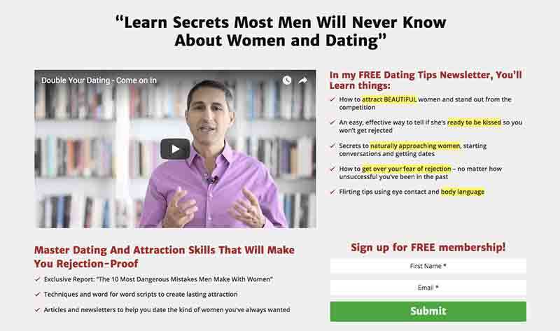
This one is an old landing page but very very effective. It was created by Evan Pagan back in 2004 when he went by the ghost name David D'Angelo.
Pagan created this remarkable landing page for promoting his free newsletter about dating tips.
And guess what?
He garnered around $20,000,000 just with this lead capture form.
Just notice how the page looks all tidy and simple, nothing fancy. It’s all white on white with a youtube video embedded on it. And, the video is less than 3 minutes long, so the visitors are most likely to watch it complete.
You can see a black colored headline with a hook that shows what the viewer would get from Pagan’s informational offer.
On the top right corner, there are five bullet points offering additional insight to the headline. See how he’s highlighted the phrases that are tempting…. ‘attract beautiful’…. ‘ready to be kissed’….. ‘Get over your fear of rejection’…..Genius!
And then right under this bullet list, there’s his CTA button, an invitation to sign up for free membership.
What we like the most about this landing page is that the form is super simple with just two entries. Everything is dead right –from the page design to the language used. Short, sweet, and really effective.
Although this page example is a tad older, this unbelievably simple design still works for marketers today.
2. The Motley Fool
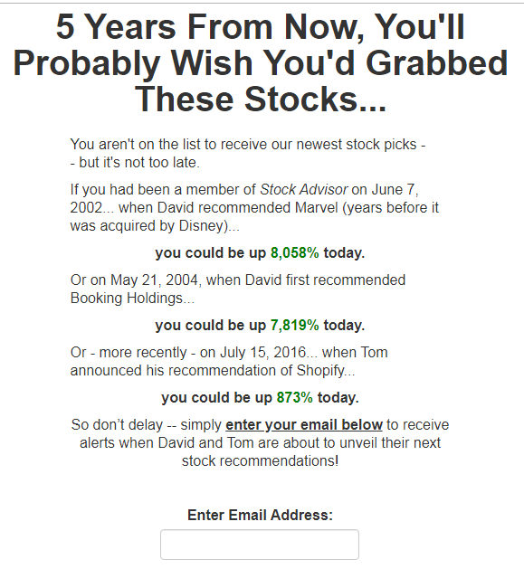
Here’s another lead capture landing page we really like. And it’s still currently running.
The Motley Fool is a multi-million dollar business that provides private financial and investment advice. This landing page is created to promote their financial newsletter which includes their newest stock picks.
This page is also very simple, looking like Web-1997. There aren’t any images but the text is really powerful.
Basically, they’re promoting a guide for stockholders who want to know how to choose the best profitable stocks.
See how brilliantly they’ve worded the headline. It’s making the visitors not only inquisitive about those stocks, but is also adding FOMO (the fear of missing out) when they look back five years from now.
They’re smartly playing with human psychology with this copy as the fear of losing is always stronger than the wish for gaining something.
Here’s another striking element: Their headline mentions a very explicit amount of time when visitors can anticipate to see their ROI.
The landing page design is simple, with their logo at the top, and the fear of missing the boat is expressed thrice in different variations. You can also see information on opportunities that visitors might have missed already.
Overall, there’s nothing fancy on this page, just a frank and explicit set of expectations from signing up for the information.
3. Mike Dillard

Who doesn’t know Mike Dillard? He’s the man behind tons of incredible webinars and books about successful entrepreneurship. And he has earned every right to get his picture on the front of his landing page.
Just see how simple and to-the-point his landing page is. There’s a beguiling headline that openly tells you what you’re going to get, satisfying the urge digital marketers have.
You can clearly see when the next class is and there’s a crisp CTA.
Here’s something different on this page….
…..Just under the CTA, you can see how many Facebook users have liked this landing page. It adds that extra drive by showing visitors how Dillard is the real McCoy.
Once you click on the “Reserve My Seat” CTA, a pop-up appears which is where the visitor enters their email address.
By asking the visitor to click on the CTA before submitting their email address is a micro pledge that’s very potent.
When the visitor clicks on the CTA, they’re already in the “purchasing” mode and is more probable to enter their info as they’ve already initiated the process.
4. Number One Book System –Free Guide By Ryan Deiss
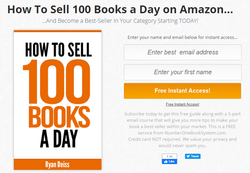
Here’s another kickass landing page example that’s super simple yet super effective. It’s promoting a free guide by Ryan Deiss on how to become the best-seller author on Amazon.
There’s minimal text –just a headline, a ‘Free Instant Access’ CTA button, and an image of the offer.
See how the headline clearly mentions the number of books you can expect to sell every single day. And the image just reiterates it.
Everything is above the fold, no scrolling needed.
Right under the CTA button, it mentions how you’ll be getting an exclusive 5-part email course along with this free guide once you choose to subscribe. Then they reassure that you won’t need any credit card to sign up and that your email address won’t be used for spamming.
Plus, it also includes a social media link to LIKE them on Facebook.
This landing page is currently running and it’s already crushing it. Believe it or not…this super simple page is yielding at least $5 million every year!
5. Eben Pagan Training, The Virtual CEO
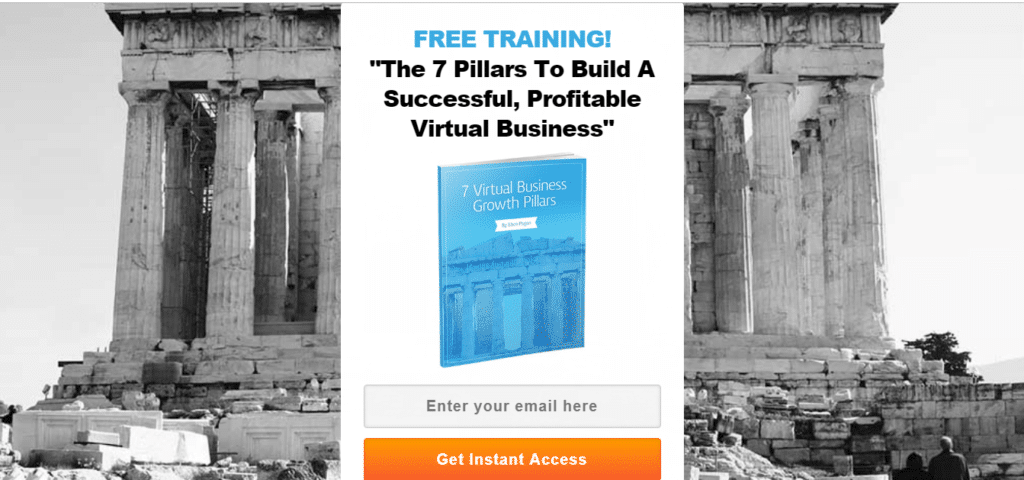
Here’s another simple yet effective landing page that has no copy at all. You can only see the headline, an image and the CTA.
It clearly mentions right at the top that they’re promoting a free training. And, the headline shows that they’ll be covering the 7 pillars to build a successful online business.
This is a really smart move as research suggests that 'number' headlines offer more benefits and increase conversions.
In the image, you can see the shorter version of the headline plus the creator, Eben Pagan’s name.
There aren’t any fancy form fields. You only have to enter your email address to get instant access to your free training.
Again, everything is above the fold. You don’t have to scroll down. To the point yet crushing it!
6. Product Launch Formula
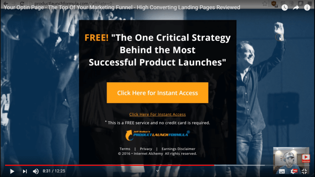
Jeff Walker’s Product Launch Formula is a recognized, step-by-step process that helps you launch a product via detailed guidance. You learn exactly what to do at every step of the way, right from which blog post to publish when, to what to communicate in every email.
This landing page by Product Launch Formula is no longer running. It was created in 2016 to promote one of their successful product launch trainings.
Just look at how the headline is building curiosity by mentioning ‘One Critical Strategy’. Again, there’s not much text or heavy duty graphics. Just a headline and CTA. No fancy features!
Once you click on the CTA, a pop up appears asking for your email address. Right at the bottom you can see their Terms, Privacy Policy, and Earnings Disclaimer.
Pretty straightforward!
7. Conversion Gods
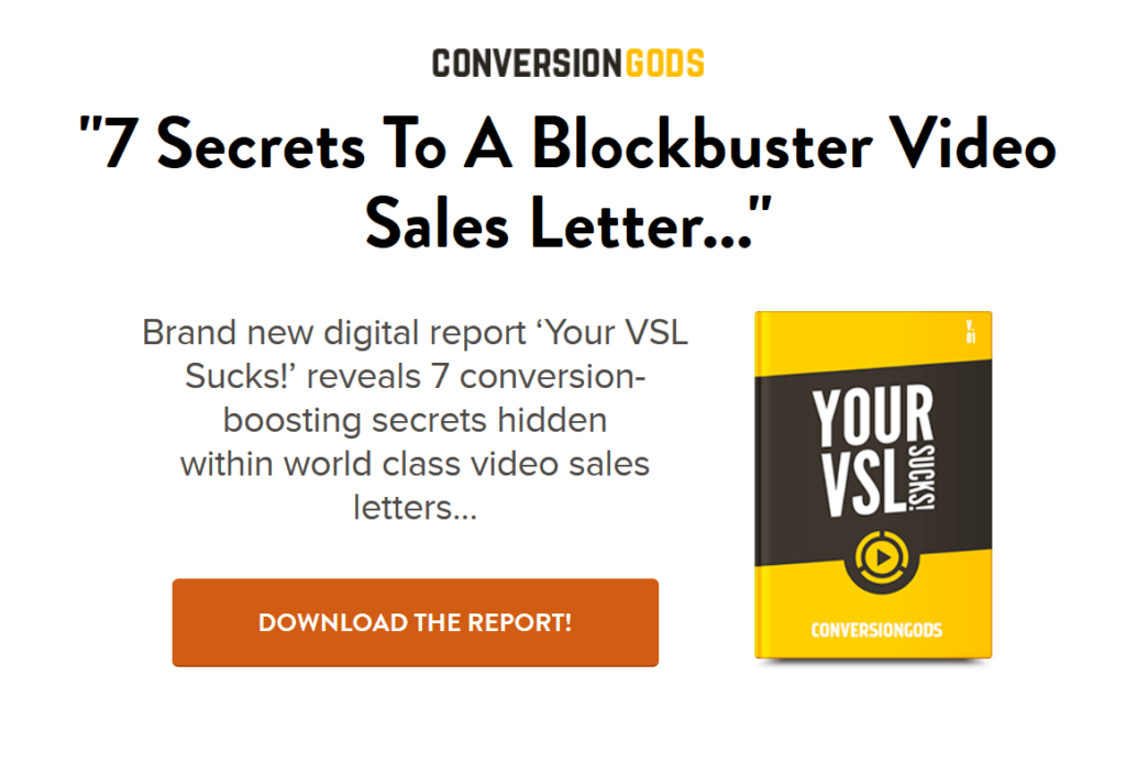
Here’s another super sleek landing page example by Conversion Gods. It features their digital report on how to come up with a high-converting video sales letter (VSL) by using just 7 tips.
Again, this landing page is using a number heading for better click-through-rates (CTRs). There’s a crisp headline at the top, just under their logo, and an image of the offer on the right side.
See how they grab attention by exclaiming that your VSL sucks so that you’re intrigued to find out why.
There’s no lead capture form. You just have to click on ‘Download the Report’ CTA.
And, once you click on it, a pop up appears asking for your email address and mentioning how they’ll rush your FREE special report directly to your inbox.
8. Ecom Success Academy
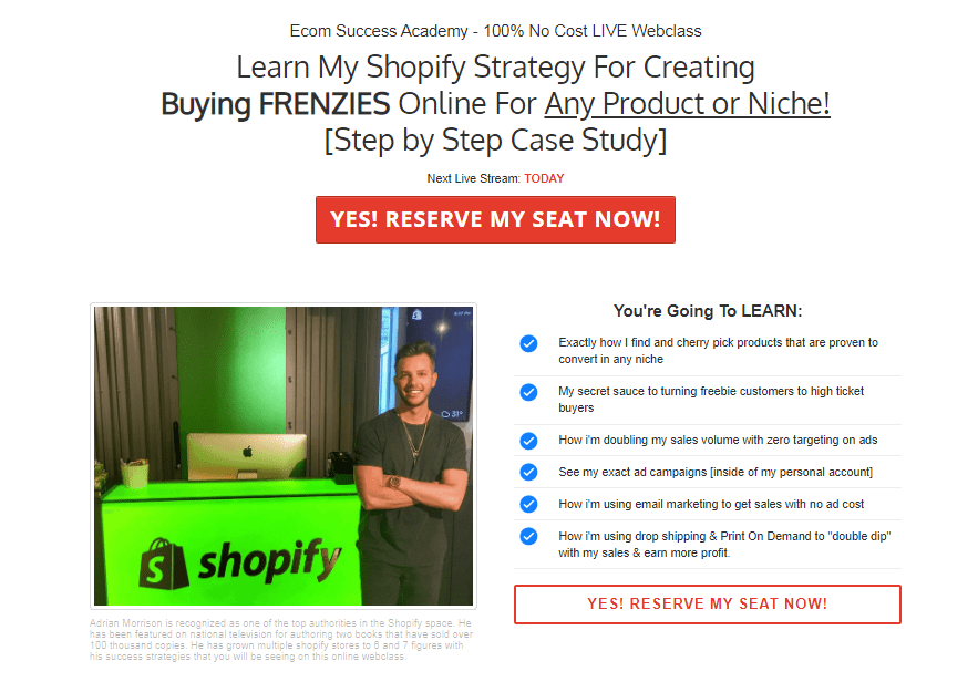
Ecom Success Academy is a cutting-edge training course which discloses how Adrian Morrison constructed a $4 million per year virtual business with just one simple Shopify store. He uses modern dropshipping features, highly targeted Facebook traffic and e-commerce, without any upfront expenditures or investments.
This landing page example includes all the essential elements of a high-converting opt-in page. It clearly mentions the offer ‘100% No Cost LIVE Webclass’ and the headline gives away that you’ll learn one of Adrian’s own tried and tested Shopify strategies.
See how they’ve bolded two words and underlined a few words in the headline to grab attention. Plus, they clearly mention how they’ll cover a step by step case study in their online class.
You can see when the next live stream is and the CTA button shows excitement via a personalized verbiage.
Right under the CTA, you can see the image of the host and a bulleted list of 6 points on what exactly you’re going to learn in this webclass.
You can see a brief description of Adrian under his image which is a proof that he’s the real deal.
9. 9-word Email
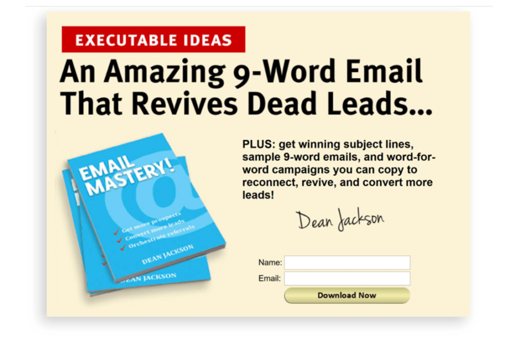
The 9-word Email is the brainchild of Dean Jackson, a prosperous real estate magnate and digital marketing expert. It was created in an attempt to re-engage lost prospects.
Jackson claims that a subject line with just the recipient’s name and a body with a single line question (originally 9 words) is all you need to increase your prospects.
This example is one of Dean Jackson's landing pages that convert over 60%. He teaches the '9-word Email' himself and this is for people who want to get more subject lines, sample 9-word email templates and more word-for-word campaigns.
So he does a great job 'pre-framing' them before he even makes his offer... But again... SUPER SIMPLE!
Just look at the headline. It promises to teach you how to write an amazing 9-word email that revives dead leads, scratching an itch most internet marketers have.
The best part is that you only have to enter your name and email address to download his offer right away. That’s all.
10. Mike Filsaime
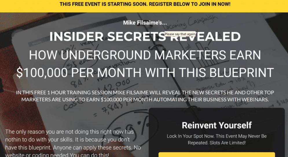
Mike Filsaime is an entrepreneur, digital marketer, author, speaker, software developer, online marketing educator, marketing consultant, and what not!
He created this landing page to promote his hour long training session that promises to reveal secrets of established marketers about how they built their $100,000 per month worth of online businesses.
While it does create a curiosity by promising to reveal insider secrets, honestly, there are a couple of things we don't love about this landing page.
Let’s be real: Mike is a very smart marketer and he has been probably testing different elements on this page.
But, we don't love the busy image in the background. It kinda competes with the text and makes it more difficult to read than it needs to be.
Also, we don't love that the CTA button color matches the upper header color.
Honestly, tweaking those things may not increase conversions and Mike possibly tested this version as the winner but we believe it would've been better if the background image was a lot simpler and the text was in bullets.
But we do love how he’s created this sense of urgency by mentioning how the slots are limited and that you should lock in your slot NOW. Plus, they’ve created the FOMO effect by saying how the event may never be repeated.
11. Shopify
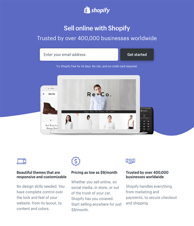
Another great landing page example on our list is Shopify's trial landing page. They’ve kept it super simple and sleek.
The user-oriented headline includes just a few words and you can see how they’ve mentioned that they’re trusted by 400,000+ businesses worldwide to add authenticity.
There’s no fancy lead capture form. You just have to enter your email address to get started with your trial. Right at the center, there’s an image showing how you can use their platform on any device.
And then there are simple bullets instead of chunky paragraphs, communicating the trial's specifics and benefits.
All of this makes it straightforward for you to get to the point: selling online with their platform.
12. Teambit
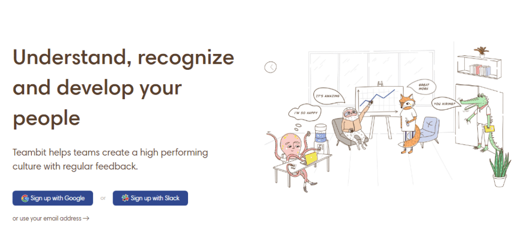
What comes to your mind when you think of HR software?
We bet quirky is not even on your mind!
This landing page by Teambit is loaded with illustrations that make it attractive and fun. The headline is sleek and crisp, targeting the main functions HR has to perform.
There’s a simple, single field form that asks for your email address to get started for free. Alternatively, you can also sign up with Google or Slack.
Right next to the form, there’s an image of an enjoyable workplace full of animal characters –who are all very satisfied with their software, just in case you’re wondering.
As you scroll down, you see many more animal characters, each explaining a benefit of this tool.
We believe this landing page is the perfect example that you don't need to have a conventionally "entertaining" product/service to come up with an amusing landing page.
13. Magento
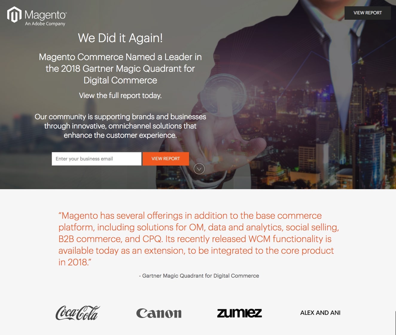
Magento is an Adobe company that offers ecommerce solution for businesses of all sizes and industries.
This was their landing page last year. They’ve used a one-field lead capture form that’s suitable for a free report and probably yields a lot of conversions as leads don’t have to provide too much personal information.
The CTA button is relevant to their offer and the bright red button color contrasts with the rest of the landing page. They’ve added client badges from Coca Cola and Canon to add social proof to their page.
Next, there’s a Gartner quote, giving the visitor a glimpse of what the report will cover.
Their headline is unique but isn’t very convincing. The supporting headline provides more information but it still talks about the company. We believe it should have focused more on the visitor to increase conversions.
The background image is a little unclear. We quite don’t understand how transposing cityscape on a person’s body inspires visitors to download their report.
Another thing we don’t like about this page is the gray CTA button at the top right corner as you hardly notice it due to the already gray background.
14. Guideline
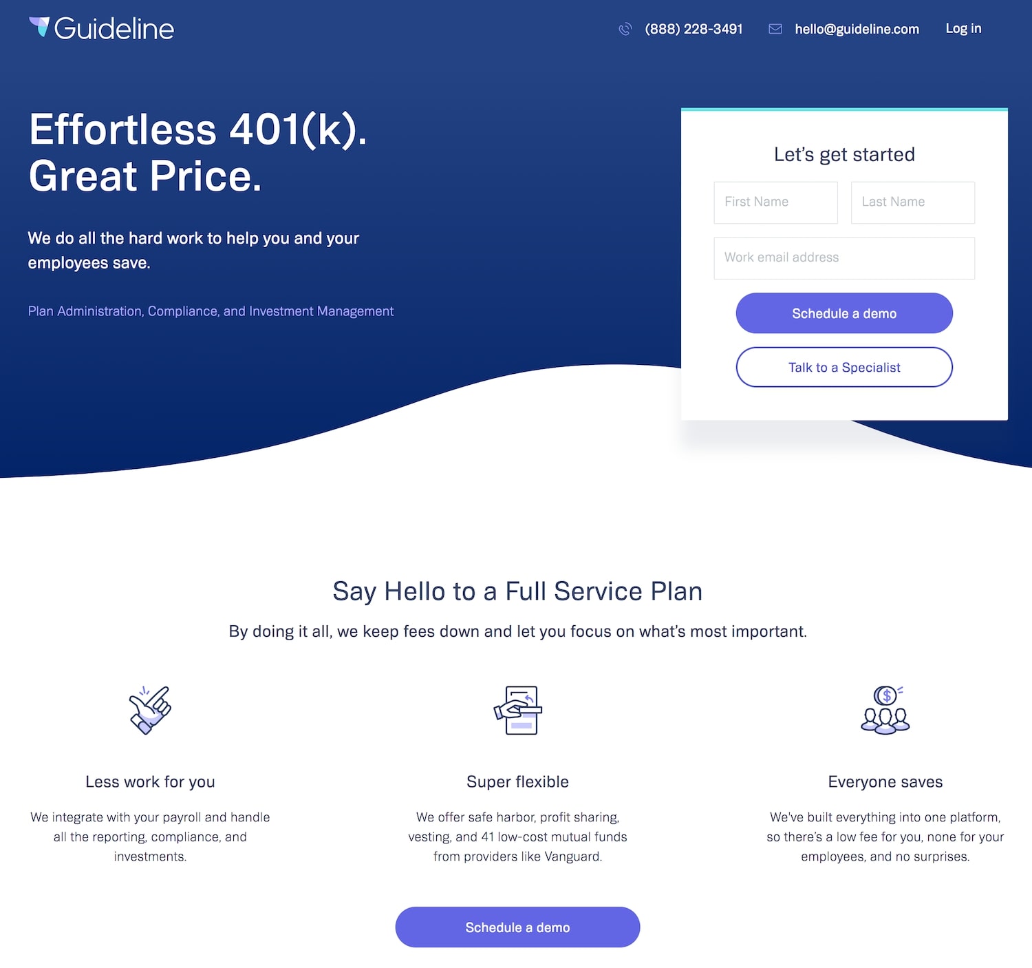
Another landing page that caught our eye is the Guideline’s landing page. It’s a retirement planning company based in the US.
You can see how their headline highlights the company’s unique value proposition. But we think it should have been a bit more descriptive to be more persuasive.
The lead capture form is brief and doesn’t request needless information. You only have to enter your first and last names, and the email address.
The primary and secondary CTA buttons both have clear copy; you can schedule a demo or talk to their specialist.
There’s plenty of white space throughout the landing page, making it visually attractive. It’s likely to not create any uneasiness for the visitors.
You can see there are bullet point benefits, making it easier for you to absorb all the info and understand their 401K program.
We’d recommend testing this page with positive customer reviews to help visitors make their decision. After all, these testimonials would let the visitors observe how others have benefited from their service.
15. Munchery
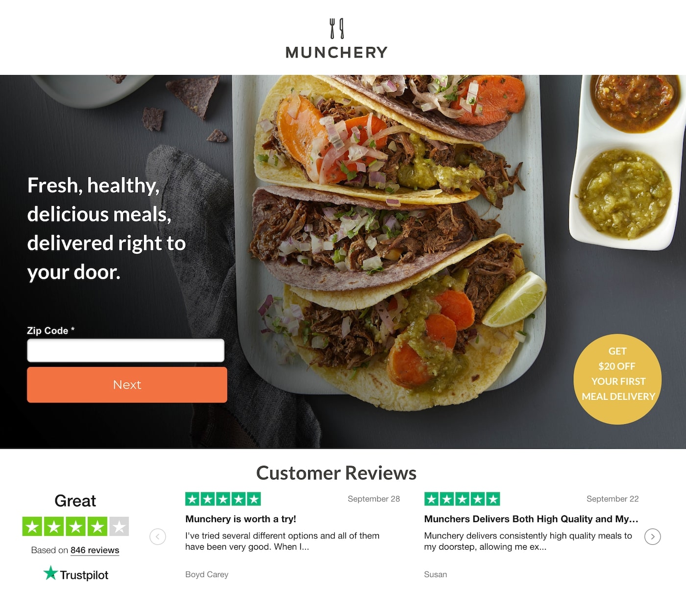
Munchery Inc. is an online food ordering and meal delivery service that’s no longer operating. This was their landing page in January 2019.
You can see how their headline explicates their services. It promises to deliver fresh, healthy food to you without you leaving the comfort of your home. Pretty tempting!
Look at that background image…. simply mouth-watering and irresistible. Plus, it’s totally relevant to their offer.
On this page, you only have to enter your zip code and when you click ‘Next’, it takes you to a multi-step form where you have to give away your address.
Right under the CTA, there’s a 4-star rating based on nearly 900 Trustpilot customer reviews, adding social proof. It definitely helps the visitor decide whether they should order from this service or not.
Plus, there’s a $20 off badge at the bottom right corner, encouraging first-time visitors to take action and order food. However, we think this $20 off coupon could have got more attention if it was included in their headline. Perhaps, the visitors would have noticed it as soon as they landed on this page.
Conclusion
To create successful landing pages, you need to learn from the pros. You want to apply the good things they are doing while avoiding the things you’re not supposed to do.
You don’t want your landing page to bomb on you.
So get your headline rocking, build up that element of trust, level-up your credibility, write dynamic copy, and follow these examples to absolutely CRUSH your landing page goals!
I hope that this has been a helpful post for all of you! Hit me up below if you have any questions or comments. I would be happy to help you out if you need it!
See you next time!