So you want to know the secrets to writing Facebook ads that consistently turnover profits for you and your business?
I know Facebook ads have become a bit of an enigma. There are so many varying opinions on what works, and what doesn’t work.
It can literally drive you mad (I’ve seen it happen lol)!
But in my honest opinion, it doesn’t have to be this hard for you.
There’s actually a simple process you can follow that will ensure you write profit pulling ads every single time…
… It’s studying what’s working for GREAT marketers.
I know it sounds simple, but people are still writing ads blindly without really knowing what’s working.
You could literally spend years with trial and error, trying to break the code to profitable ads…
… Or you could just look at what the top marketers are doing, and take notes.
Study Examples Of What Is Actually Working For GREAT Marketers
The thing to understand is, the top marketers are spending millions of dollars every single year on Facebook ads…
They are spending thousands every day testing ads…
They are spending the money to figure out what is working…
Learning how to study what they are doing, and implementing what you learn could literally shortcut your way to profitable ads… and not only save you wasted money, but also years and years of trial and error, stress and frustration!
This is a skill…
… and a skill that you must learn in order to make Facebook ads work for you.
And that’s why I created this post.
I am giving you a whole bunch of proven Facebook ads from some of the very best marketers on Facebook, all of which are from my personal swipe file with deep analysis explaining why they work!
Use them, study them, and dissect them.
What makes them great? What makes them profitable? Are there any commonalities between them all?
This can literally unlock the profits in your own Facebook ads!
The Best Facebook Ads and Why They are Crushing It
Facebook AD #1
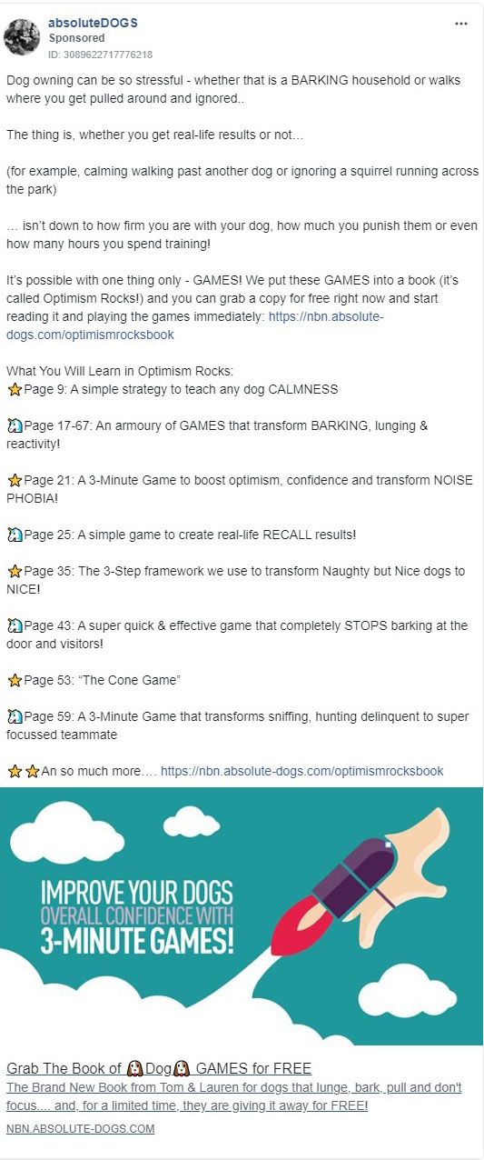
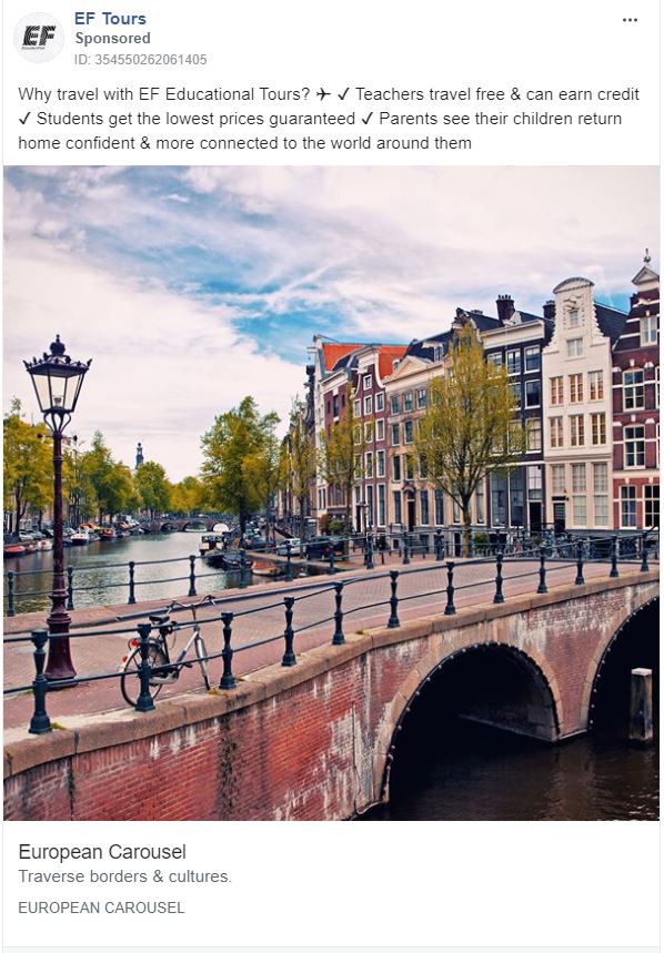
Notice how this Facebook ad example meets the reader where they are… Stressed out about dog ownership.
Then it introduces a completely new BIG IDEA, that “games” can actually train the dog.
Now, this whole “dog training” thing, which felt difficult and scary at first, is going to be a fun game instead. As far as good ads go, it's brilliant!
The BIG IDEA Is What Makes This Ad Work
This ‘one BIG IDEA' is possibly the most powerful pattern in successful Facebook ads, and is straight from Michael Masterson's Book “Great Leads, the 6 ways to start any sales message” which I HIGHLY recommend you buy and read if you plan to master Facebook ads.
Also notice how their bullet points call out the exact pages upon which their specific “solutions” are presented.
This not only opens a loop that can only be closed by taking action, but it allows the advertiser to connect with dog owners facing a number of different challenges… which will then, in turn, allow them to penetrate more of their target market.
Facebook AD #2
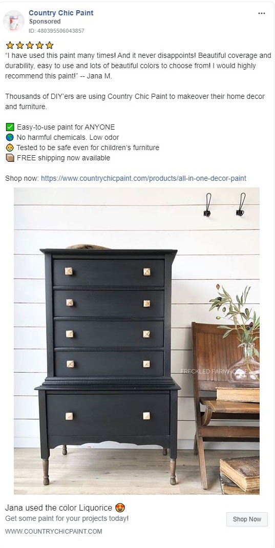
Starting out with a five-star testimonial Facebook ad and including the gold-star emojis creates WAY more trust quickly, compared to just ‘stating the facts' or writing ad copy.
“Thousands of DIYers” adds even more social proof to the mix.
The Bullets Answer Their Customers' Most Common Objections, And They Have Multiple Calls To Action
The image uses intense contrast to show the finished result.
Also, notice that it's even a farmhouse chic style, which is super trendy right now.
Selling paint on FB?! yep… and doing it well!
Facebook AD #3
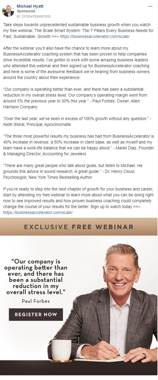
He Has Testimonials For Social Proof And Third-party Validation, Followed By Another Pitch And Call To Action…
The image also has a testimonial, from a well-known and respected family name; adding even more credibility.
He is boldly saying “I'm the best, if you want to work with the best here's where to go!”
This Facebook ad example has been running for over six months, which tells me it is working very well.
A great example of how to retarget a warm audience to a webinar registration and sell high-ticket coaching.
Facebook AD #4
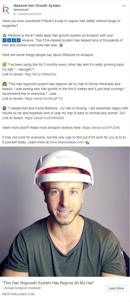
The image here is definitely a scroll stopper.
It kind of looks like he's saying something, kind of looks like he's uncomfortable with this audit device on his head… People will slow down and think “what is going on here?” and ultimately it is a product demonstration.
From here, the reader will read the lower headline below the image, which is a testimonial that explains exactly what the device is doing…
The Reader's Natural Behavior After This Is To Read The First Line, Which Asks Them A Simple Yes/No Pre-Qualifying Question… Followed By Proof, Proof And More Proof!
- “FDA cleared”
- “#1 Rated on Amazon”
- “over 1000 reviews”
- “has helped tens of thousands”
- “Men and women”
… that second paragraph has a ton of confidence-boosting copy, followed by three testimonials and a link to even more reviews…
Remember that on Amazon the reviews are on the sales page, so that is technically a link to the sales page masked as a link to the reviews.
That is brilliant!
Facebook AD #5
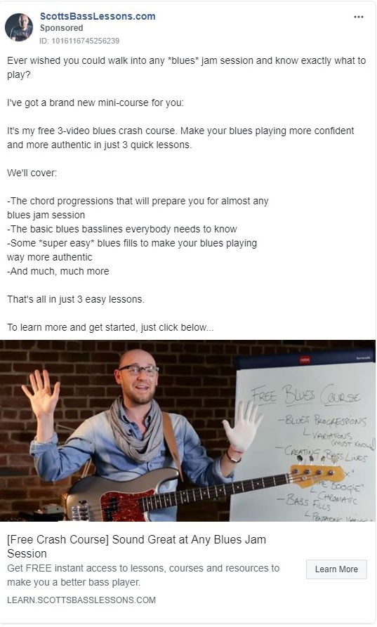
The image here resembles the body language someone would use to say “stop,” which is clearly a way to get people to stop scrolling.
Mix that with the bass guitar and the words written behind him “free blues course”… and any musician, guitarist, or bassist would probably stop and take a second glance.
This Leads Them To The Opening Question, Which Touches On Several Different Tactics
It's a question, it's extremely specific down to the type of music (I bet he has targeting that overlaps with blues), and it addresses the number one problem/fear his audience has.
The next line is the solution… Followed by some bullets.
To improve this, I would add emojis for the bullet points.
I would also increase the specificity of the bullet points, and add some spacing between them. I would also include a link at the very end of the text so they can click the link…
All in all, it's a great cold traffic lead generation ad.
Facebook AD #6
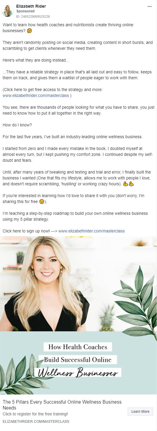
In great Facebook ad examples, the image is the most attention grabbing part.
If you notice, she actually created a taller than normal ad by including some color and her main headline in the advertisement below her picture.
Humans Stop When They See Faces, And Adding Her Headline Right Next To Her Face Was Really Quite Smart…
It's a total call-out to health coaches in the image, which is going to ‘sort' the audience fast.
Taking a problem/solution and question/answer approach, it transitions quickly to pseudo-teaching with a link for more right in the middle.
Then She Tells A Quick Story, Reinforces That It's Free, And Repeats Her Call To Action
Also notice she has branded the strategy as her own “five pillar” strategy, but I bet if you learned it, it would be the exact same thing you already know… just repackaged in a ‘masterclass' container.
Facebook AD #7
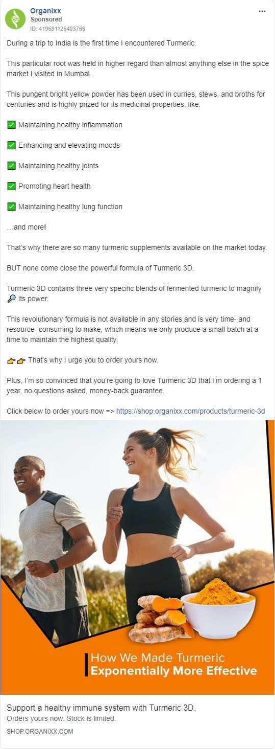
This supplement Facebook ad has been running for a couple of months.
Although a two month runtime is not extremely long for a successful Facebook ad, supplement ads are notoriously difficult to run on Facebook without getting them turned off.
That makes this ad interesting. It tells me that Facebook really likes it.
The Imagery Is A Little Cheesy, But Combines Three Key Things…
The people give it the health and fitness vibe, the color and the herb image clearly call attention to people who know about the benefits of turmeric, and the headline promises that you are about to learn a secret.
The reader jumps up top to the main text, and gets drawn in by a story hook, followed by the benefits, bullets, and ultimately a call to action.
This is not just a Facebook ad, this is a short form sales letter in an ad… with a huge 1 year money back guarantee and all.
Facebook AD #8
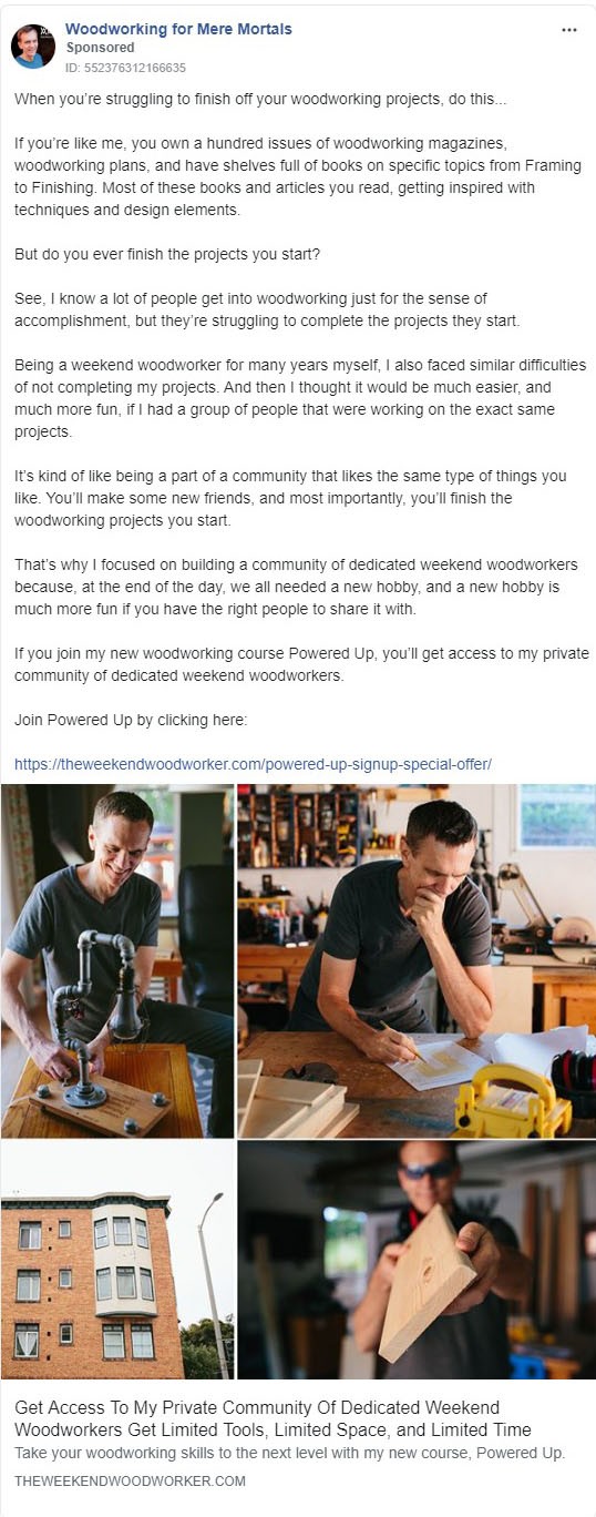
This Facebook ad does a great job of connecting with the common fears and frustrations based around a potentially expensive hobby, and is one of those Facebook ad examples that tends to slow the user's scroll because of how much data there is visually with four images in one.
The first line of this Facebook ad is designed to sort their audience and to draw-in woodworkers who are struggling or frustrated.
After the first line, it goes straight into rapport and finding common ground with the user.
This Collection Of Elements Makes The Ad Elicit The “He's Just Like Me” Response, Which Precedes The Belief That He Can Help
Not only can he help, but the entire community is there to help make woodworking easier and more fun.
This is a perfect Facebook ad example for the old-timer who decked out his garage, turned it into a shop, and is saying… “damn, I wish I had some way to learn how to use all this expensive equipment!”
This Facebook Ad Has Been Running For Four Months
It's very direct, it's clearly promoting the course, and the fact that it's still running means he's making money on it.
Simple, direct, thoughtful… It works
Facebook AD #9
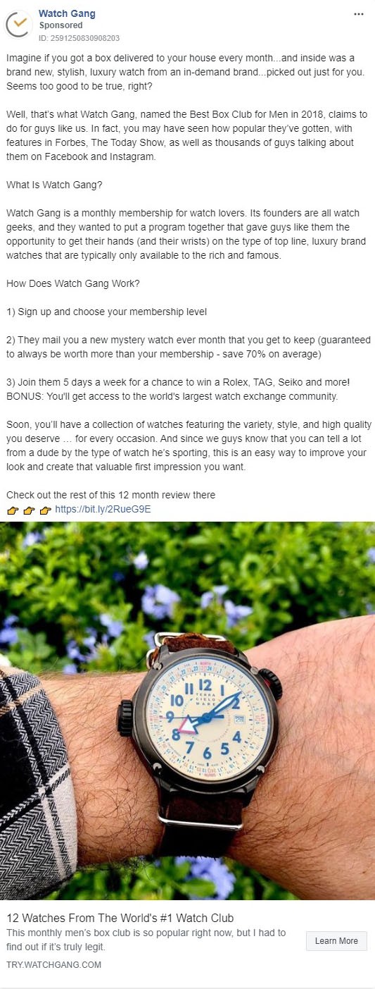
If you didn't already know, “wristwatch porn” (totally safe for work) is actually a thing.
(Risky click of the day right there, LOL!)
There's also a HUGE sub-culture of “Watch addicts” on social. And they love drooling over watches that cost as much as a car, sometimes a house.
With that baseline set, the most interesting thing with this Facebook ad example is the offer itself.
This is what I would call a “dream come true offer” for watch addicts… they get to wear thousands upon thousands of dollars of new fancy watches, impress their friends each and every month, and don't even have to ‘sell the farm' to do so.
Said another way, it can make people look wealthier and more successful than they are.
STATUS is powerful.
The Ad Uses A Big Bold Image Of A Watch, Which Makes This Ad Incredibly Appealing To Their Target Demographic
I assume they split test the image aggressively, since that's the real attention grabber for their audience.
The opening paragraph is a future pacing statement to get the reader to visualize what their life is like with the service. By the end of the first paragraph, the reader is either all in or thinking “not for me.”
Again, Great Marketing Is About Sorting The Wrong People From The Right People
Since this is a new BIG IDEA for most people, they transition into the “what is it” and “how does it work,” and they sneak in some fancy brand names to really wow the reader.
This lets them know that it isn't some Seiko and Casio watch club. These are the set up punches.
The Second To Last Paragraph Is The Real Knockout Punch
It’s just two sentences, but it is deeply psychological and extremely persuasive… tickling the “I need more status in my life” part of the reader's brain.
People spend crazy money for status!
The call to action in this Facebook ad example is to read a review, click the cta button, and go to the sign-up page.
This Is Going To Keep The User's Guard Down And Get Them On Site So The Cookie Gets Planted
It will also lead to them consuming even more information about the club.
And I guarantee that that page is written more like an advertorial… An editorial piece that is actually an advertisement, with a direct call to take action.
Facebook AD #10
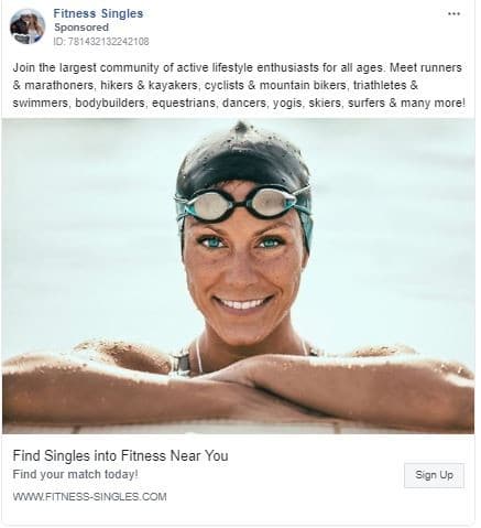
The two most interesting things about this Facebook ad example are the fact that it is a “dating niche” site, and that this particular Facebook ad has been running for 12 months straight.
99.9% of people who try to get Facebook ads approved in the dating niche fail, but this one works… A good example of how to walk a thin line in a gray area.
They have not used the words ‘dates' or ‘dating.'
‘Singles' is in the fan page name, but not the top text.
They did use the word ‘singles' in the lower headline, and it is impressive that it got approved.
But again, they're using the word “match” instead of “date”.
The Imagery Really Makes This Ad Stand Out, And Shows So Clearly How Compelling Humans Eyes Are…
The contrast with her blue eyes and her smile just staring at you make it difficult not to take a moment and look into her eyes, which will stop the user from scrolling and get them to take another look…
Oftentimes, having the image with a person looking straight at the camera can be distracting… but since this is in the dating niche, it enhances that captivation that one might feel on a first date.
It’s Powerful!
Facebook AD #11
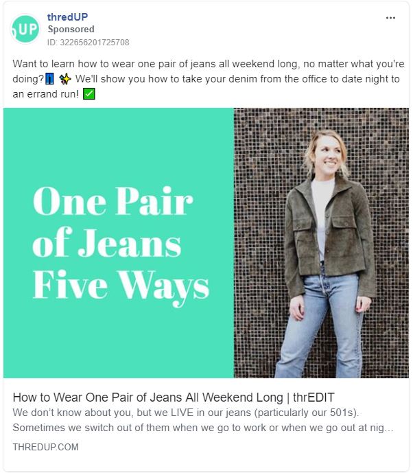
Just in case you're not aware, thredUP is the Internet's largest thrift store.
This ad example is kind of tricky, because the imagery makes this ad look like an advertisement, but it's actually a link to a piece of content… Clever.
Also worth noting, this Facebook ad has been running for over 11 months… so clearly it is adding value to their funnel, whether it's directly treating sales or not.
My internal chief marketing officer speculates that they have data showing that pants are some of their best-selling inventory, hence them taking time to run Facebook advertising that teaches their target audience how to get the most out of the jeans they already own.
And of course, there will be an opportunity to re-target people who click and read, showing direct ads for specific jeans if they don't click on the “shop now” link at the end of the post.
This is a great way to run content focused advertisements that deliver value and still move the needle in sales and revenue!
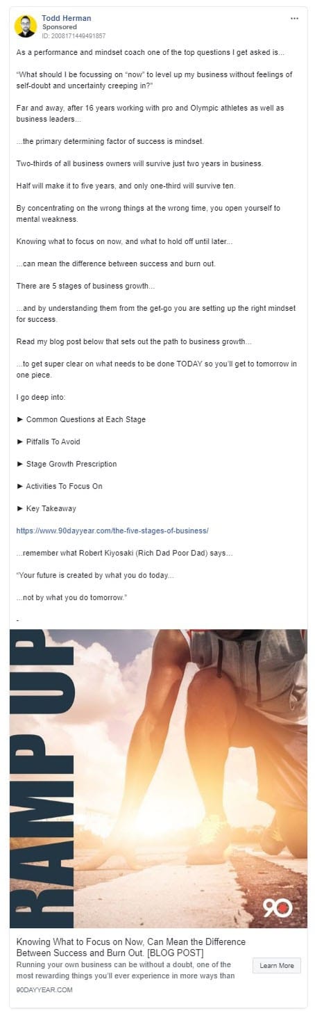
Facebook AD #12
Above is just the ‘short preview' of a long copy story ad (the rest is below) that's been running for over 9 months now…
The image has STRONG contrast with the bright light, with a catch/buzz phrase that his best client will self-identify with.
The headline below the image is designed to get the reader to lower their defenses… CLEARLY stating this is a blog post, not a ‘sales pitch'… Smart… especially if targeting entrepreneurs who are targeted often by webinar after webinar.
This Is A ‘Zig’ When Everyone Is ‘Zagging’
Now in the ad copy, the first line does 3 powerful things…
- It establishes WHO he is
- It establishes WHAT he does
- It provides social proof… People ask him questions, which presupposes he has clients and that he has a clue as to what he is doing
Then, the question.
This is the opportunity for the ‘right' type of person to self identify by thinking “Yeah, I have that question too…”
This is the ‘hook' in action… It either HOOKS in the right kind of person, or they scroll past.
Great Advertising Sorts The Right/Wrong People, It Does Not Just Try To ‘Sell'
3rd line above the fold… he's flexing a bit… AKA – Establishing credibility.
16 years with ‘pro' and ‘olympic.'
When people have the chance to work with the best… They want the best.
Then if you click ‘read more,' you get hit by a quick 1-2 punch…
Facebook AD #13 (Continued From AD #12)
First, punch number one… He is ‘paying off the promise' made above the ‘see more' link in the next line… This is the setup punch.
Then, punch number two… he hits hard with the ‘scary statistics' that PROVE you are probably going to fail…
Unless…
You read his blog post/landing page, get his retargeting cookie, and begin your journey into his funnel.
All of this makes this ad very compelling.
Very smart angle/ad in a super competitive space.
Facebook AD #14
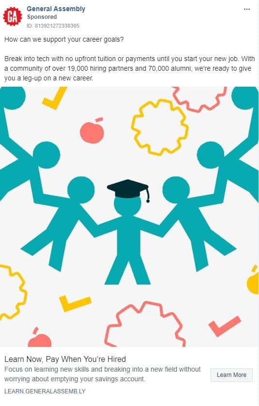
There is a lot packed into this short Facebook ad example.
The lead-in question is clearly calling out people who are either frustrated with their jobs, under or unemployed, or who don't feel like they have a chance to achieve the goals they desire.
They Establish The Need And Hook The Right Reader Within 7 Words
Then they lay into their benefits, which contain their USP. This ultimately is their sales pitch…. 15 words.
“Break into tech…”
Outsiders who think that's where all the money is, and feel like they're under-educated or under-qualified, will love this phrase.
“No upfront tuition payments…”
Sounds as good as free.
“Start your new job…”
This, again, reinforces the big benefit.
The Next Sentence Transitions To Social Proof And Reinforces The Imagery, Which Is The Thought That You Have Support
All in all, this is a new BIG IDEA.
You get educated for free, and pay it back once you get the new job you actually want.
So their whole call to action is “learn more” because really, they're building desire and credibility while piquing interest.
So people will think “how does that work?” And it induces hope…
That makes this ad great at communicating the idea quickly.
Honestly, writing this efficient of a Facebook ad example with so few words, but that still conveys the proper meaning, is the sign of a seasoned veteran… and is quite difficult to pull off.
That said, their “offer” is extremely unique and extremely valuable to the right people, so the power of an irresistible offer is a big driving force in this Facebook ad.
Facebook AD #15
Another great example of the power of “ONE BIG IDEA”.
The first sentence/questions pulls the reader in with a promise, and opens a loop to cast doubt at the same time.
This HOOKS them mentally, because we can't help but to answer questions in our mind.
The hook makes this ad hard to resist.
It is tough to move on without closing that loop and finding out what the #1 thing is.
The promise is that there is an EASY 1-step way to get the desired result.
Line 2 induces a bit of fear and insider/outsider positioning that will take people on the fence and make them think “Well now I NEED to know if I make that mistake.”
Line 3 acknowledges those who are trying, and delivers the common ‘it's not your fault' emotion (remember, there's that 1 thing BLOCKING you).
Transition to a little edification via fancy titles, social proof…
“I've seen ____ over and over again…”
And then story, benefits, and 2 calls to action.
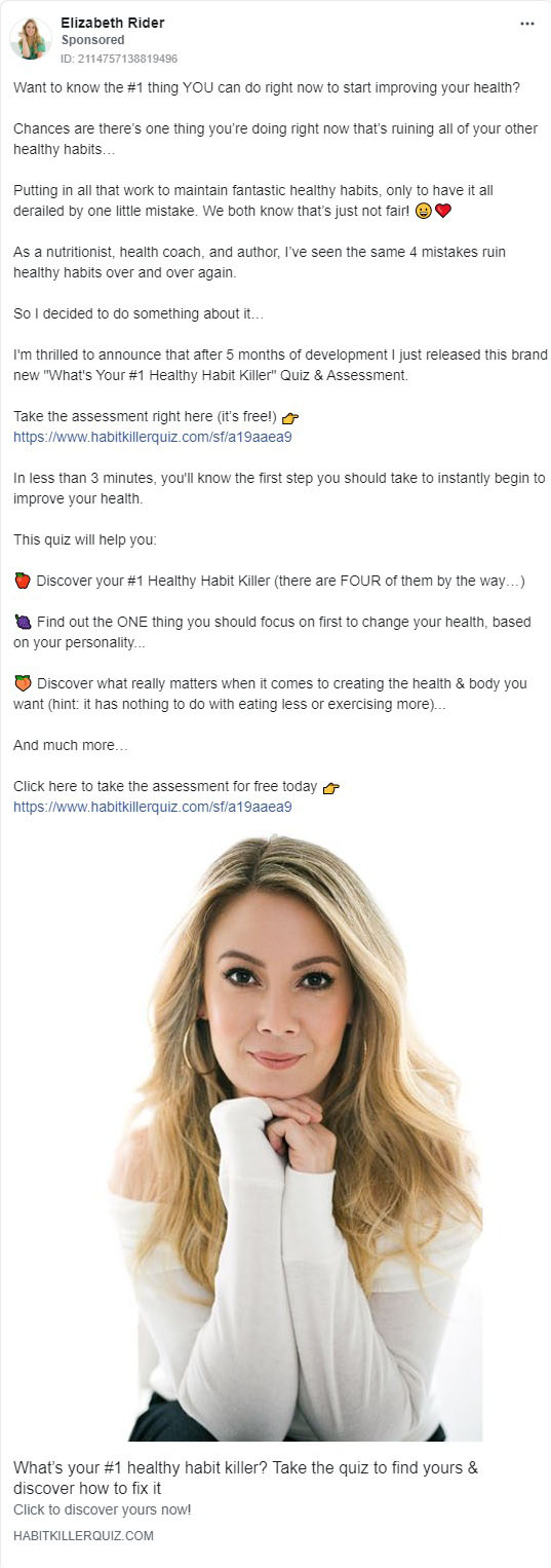
Notice A Pattern In The Imagery Here Similar To The Dating One Earlier?
Eye contact.
That stops the scrolling…
The headline has her branded phrase/idea in it, “Healthy Habit Killer,” which is the same #1 thing a million other blogs talk about.
But she branded it, so she can now own it.
Facebook AD #16
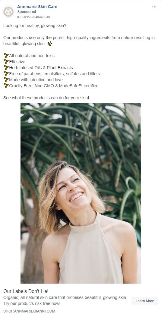
This is a good physical product ad example.
First off, you have the skinny & TALL image (takes up more real estate in the Facebook newsfeed), and then, you have the image of the extremely happy (and soft looking) lady.
There is a feeling of joy, vibrance, and happiness in here.
Why is she so happy? And what is she looking at?
The headline below the image says “Our Labels Don't Lie!”
And the mental reaction to this is “lie about what?”
All of this piques curiosity, and makes this ad hard to ignore.
Then the top-level text.
It asks a VERY direct question… an “Are you one of us?” type thing, is asked. This identifies the RIGHT person instantly…
Then It Transitions To Their Values And Benefits…
This Facebook ad example has been running for about 4 months now.
To increase the effectiveness, it could be making a specific offer… A ‘glowing skin starter pack' or something WAY more specific beyond ‘shop now.'
But since it has been running for 4 months, it is probably working.
It may actually be a retargeting ad to remind the past visitors/non buyers about the benefits, values, etc.
Facebook AD #17
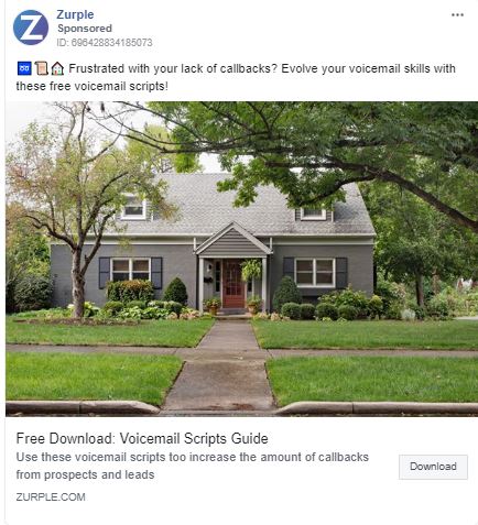
Out of all of these Facebook ad examples, this one may be the shortest… But it still reveals a new BIG IDEA.
I've never heard of ‘voicemail scripts' before.
Sales scripts, closing scripts, etc. Sure!
But voicemail scripts? That's NEW! Which makes this ad interesting by default.
The image seems to be calling out the real estate niche, so I'm guessing that is reflected in the targeting of this Facebook ad (and other ads of theirs I've put on this list).
The lead magnet/offer, a “Free voicemail scripts guide,” matches up with what I teach in the email course for sure.
Scripts/Templates work well right now. So do checklists & cheat sheets. 1 page pdfs is the ‘category' I'd put all of these into.
Above The Image, The Text Is Simple & Straightforward
FRUSTRATED by this BIG problem? Get this free solution that sounds EASY.
For lead generation, this works. It made the list because it shows how simple social media ads can be… and with 3 months of run time, odds are good that it is working for them.
Facebook AD #18
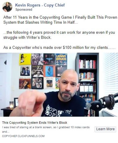
Another long copy Facebook ad example that we are going to look at starts by looking at this short version that you would see before clicking to ‘read more'…
The image evokes a “What? Me? Huh?” response, with him pointing… with an inquisitive look on his face. The headline promises to end writer's block, which is one of the largest challenges/problems faced by people who write ad copy.
The First Line In The Upper Text Is Actually His Headline
Notice how he capitalizes the first letter in each word. That's what we do with headlines.
He is positioning himself as an expert… both by calling himself a “copy chief” (what they call the lead copywriter at an ad agency), and by flexing his '11 years in the business' in the first sentence.
Then, he makes a bold promise to cut the amount of time it takes to write in half. This is probably the answer to the second most common complaint he hears…
He then declares “it works for everyone,” followed by repeating the most common pain point… followed by one more flex sharing how much money he's made his clients, and a well-placed ellipses to leave that sentence hanging (opens a loop), making us want to know where this story goes (we feel compelled to close the loop).
When you click the ‘see more' button, you get the full ad as shown below…
Facebook AD #19 (Continued From AD #18)
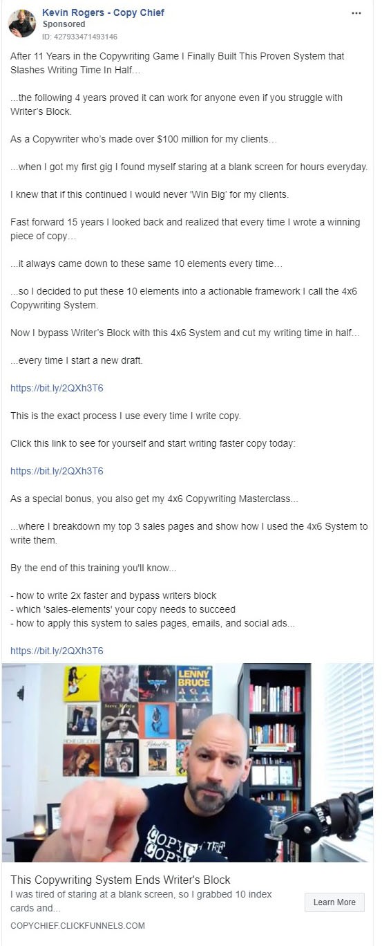
After clicking to reveal the long text, it goes straight into a story that follows the hero's journey.
The blank screen is the enemy.
He touches on the big fear, and transitions to the magic elixir that he found on his journey.
“Looking back I realize I discovered a secret…”
…and he is here now to share the elixir with you.
Spot on with the hero's journey.
Notice He Also Branded The System To Make It Uniquely His
I guarantee that you could find another copywriter from the 40's – 60's who teaches the exact same thing.
But he just put it on 4 x 6 cards and now it's a “NEW BIG IDEA!”
That also makes this ad seem intriguing.
Why 4 x 6 cards?
He throws in a special bonus to make the offer even more irresistible… and adds three bullet points for the three big benefits…
The link is in there three times, and one of the sentences tells the user exactly what to do, telling them to click the link.
His ability to hook the reader in and tell that instant, entire story with the call to action, plus a bonus in the three main benefits, in so few words, is a testament to how good he is at writing ad copy.
This Is Probably One Of The Best Facebook Ad Examples I've Seen, In The Sense That It Is Probably The Most Efficient Story Ad I've Ever Seen
Most writers wouldn't be able to get all of that in with so few words… and that's okay. It's still great to study.
Next, check out this Facebook ad, for an ad example that was written by a “normal person.”
In other words, this Facebook ad wasn't written by a ‘rockstar writer.'
Facebook AD #20
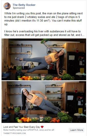
This long copy story ad begins with some WTF? imagery to catch attention.
There is actually a lot in this imagery to call out her target audience, so they can self identify with her brand awareness as “Yep, she's just like me.”
She's having fun, wearing fitness wear, has a strong core, has one sleeve tattooed up, is doing two different variations of the side plank, has a blender going off to the side, and also has a counter top full of raw/real food.
Who Does Planks On The Counter?
LOL that's a big part of why it catches attention… and instantly the user is able to self identify with her and her brand through all the stuff mentioned above.
It is actually one of several well thought out ad campaigns in this list!
Now, the story she leads-in with is focused on observing a lifestyle through a specific individual/character, and she probably used to live this lifestyle herself.
This is very contrasting in the sense that it gives the user an “either/or” choice before ever clicking the ‘read more.’
Are you like me? Happy, fit, always wearing yoga pants, doing planks on the counter in front of my healthy raw foods…
Or are you like that guy consuming that stuff living one of those lifestyles…
Very strong us versus them positioning that will get the click from people who think “yeah I'm like her.” It could also get the click from “I really need to make better choices to be more like this girl…” avatars.
Facebook AD #21 (Continued From AD #20)
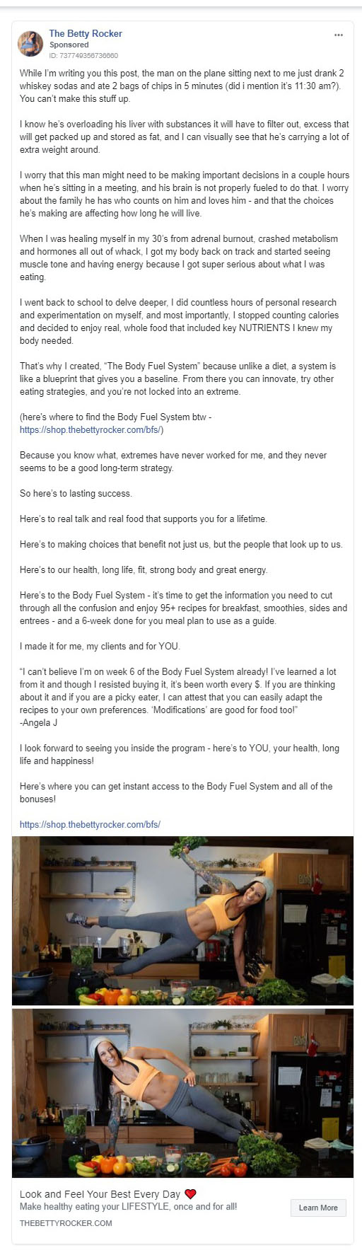
It takes until the fourth paragraph for her to transition into her particular story, which is really going to connect with the audience who's reading because it's vulnerable.
It shares that she hasn't always been able to do planks on her countertop, lol.
Her ‘hero journey' takes her back to school and through a phase of self experimentation, until she finds her unique and particular system.
This makes this ad feel real… because it is a true story.
I'd Put A Bet On It That You Could Find Other People Teaching The Exact Same Ideas
This is not a new system… it's just been branded to look like it!
After the introduction of the system, she gives us a chance to gain access if we are ambitious… but then we transport back to her story with a series of affirmations that act as bullet points, followed by a testimonial (proof) and increasing the offer's value with some more bonuses before another link…
Because if they weren't ready to click on the offer yet, maybe those bonuses and that social proof will put them over the top.
This is very good advertising, and a great Facebook ad campaign example!
Facebook AD #22
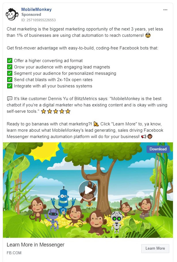
There is a very simple and powerful formula used in this Facebook ad that could cross into just about every niche.
This formula works wonders, which is a part of why this ad has been running for 11 months straight.
This is also one of the few video ads on our list. You don't need to run video ads to get attention. But sometimes, they really stand out in the news feed, and tend to be good for capturing and holding attention.
The Monkey Animation Video As The Main Attention Grabber Is A Giant Pattern Interrupt
Have you ever seen anything like this on Facebook? Most users haven't, so it stops the scroll through the news feed and gets them to read on…
This leads the user straight into the hook, which is the opportunity. They start with the overall potential, and share that 99% of people/businesses are missing out. This tickles the fear response and the FOMO.
Then we roll into the main benefits after stating how easy it is… Followed by more benefits in the bullet points with emojis, then a testimonial and a call to action.
You can, of course, accomplish a similar effect without video ads. But the video makes this ad even more powerful.
Facebook AD #23
I'm not sure if I love this Facebook ad example or hate it… There is a TON of room for improvement here, but the core structure is sound.
At minimum, this ad makes it so that you should be confident in pushing forward and publishing imperfect ads… because this particular ad has been running for nine months.
This means it's probably making good money, to the point where they don't feel the need to test it.
Imagery… Clearly Europe… Tickles Nostalgia and Wanderlust
That image makes this ad bring up nostalgia for Americans who have traveled to Europe in the past.
It could also bring up a feeling of wanderlust for people who might want to travel.
This is good because it draws people in.
The text below the ad? Facebook calls this the headline… lol. Yeah they have literally used the ad name and don't have any sales copy, LOL.
Top text? Who needs formatting… Just mash it all together in one giant block of text. LOL.
Look Up At The Monkey Ad Above And See How They Formatted Their Hook Bullets
This is way better for users and readability. Plus, those image bullet points above, on the monkey ad, really draw attention.
In this Facebook ad example, they lead with a question that is answered with three bullet points.
Each bullet point targets a specific segment of their audience, and includes the key benefit for each segment.
My Assumption Is That This Is A Retargeting Ad Displayed To People Who Have Already Visited The Website
I say this because it's simply reinforcing an idea more than it’s calling users to a specific action.
With a little bit more work they could probably better identify the audience and focus 100% of the copy on that audience.
With a little bit of layout work and some attention to detail in the call to action below, this ad would perform even better… but I want to re-state that it has been running for nine months, which means it's probably working!
Because no one runs social media ads for nine months unless they work.
Want even more Facebook ad examples? Click here and get 250 additional facebook ads from the team at LeadPages (who I use and love)
Facebook Ads Created by Pros
These ads are from people that crush it in the direct marketing space who have made a LOT of money online.
These types of juggernauts don’t even run their own ad campaigns – they simply hire an extremely specialized and skilled team that runs the Facebook ad campaign for them.
And you can bet your bottom dollar that these teams are constantly split testing their ads.
If you examine these ads and learn from them, your online business will prosper.
How to make a great Facebook ad?
Ad #1: Frank Kern Grabs You With A Question
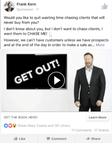
Use Questions
Frank’s team starts this ad with a question, which is a powerful direct marketing tactic.
Questions are so useful in advertising because it’s impossible for our brains to not answer them!
If someone asks you a question in a language you understand, even if you don’t verbally respond, your brain will automatically generate a response.
That’s just how we are wired.
This is important, as one of the keys to direct marketing is getting some kind of response from your audience!
Promise Answers
After leading with a question, Frank’s team promises an answer. They tell you that they will “get clients to chase you!”
This “question and answer” format is great for Facebook ads. Leading with a problem and then promising a solution is another classic format.
Cliffhangers Make Readers Click
Frank’s team uses a cliffhanger to beautiful effect here.
The sentence goes, “However, we can’t have customers unless we have prospects and at the end of the day in order to make a sale as…”.
The reader is thinking, “Make a sale as.. What? How does this help me with getting more customers and having them chase me?”
This uncertainty often leads to action, such as clicking on the “learn more” button!
Ad #2: Dan Kennedy Hooks You With: “Did You See This Yet?”
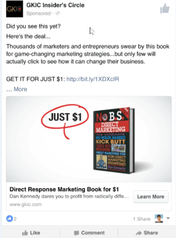
Get Their Attention First
The phrase “Did you see this yet?” is brilliant.
When people are using Facebook, they are scrolling quickly and don’t have time to read long sentences.
As you learned in the last ad, questions get responses, and this question is so short and to the point that you can’t avoid reading it!
Use Targeted Social Proof
Dan’s team is invoking social proof in a targeted way through the phrase, “thousands of marketers and entrepreneurs swear by this book”.
If you are a marketer or an entrepreneur, and if you have a decent level of trust towards Dan Kennedy, you’ll be sold on continuing to give this ad your attention.
Great copy makes each sentence so compelling that the reader can’t help but continue to consume your message.
If the reader clicks “learn more” they see this message:
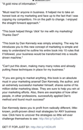
Once You Hook Them, Convince Them
Dan’s team shows this long form copy in order to leverage attention to gain more trust.
Sometimes people will be intrigued by your idea but they won’t be convinced completely. Maybe they’re a little suspicious, and they don’t trust you completely yet.
This long form copy is your chance to win them over!
Ad #3: Mike Dillard Blends Right In
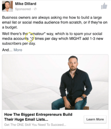
Blending In Creates Trust
One theme you may have noticed is that the advertisers try to “blend in” with the organic Facebook feed.
That’s why you aren’t seeing any flashy “buy here!” photos which would look out of place.
People are used to seeing photos of other people on Facebook, and so all of these advertisers either use an image of a person or of a book.
Use Your Reputation If You Can
If you’re a biz owner interested in online list building, you’ve probably heard of Mike Dillard.
That’s why Mike Dillard’s advertising team is using the strength of his name to gain credibility.
Appropriately, the first two things you see in this ad are Mike’s name and a very direct callout to business owners.
Blatant Cliffhangers Still Work
Mike’s team is shameless about their use of a cliffhanger. They literally just have the word “and…” right at the beginning of the line.
You can bet that was intentional.
Ad #4: Frank Kern Sells You On Free Plus Shipping
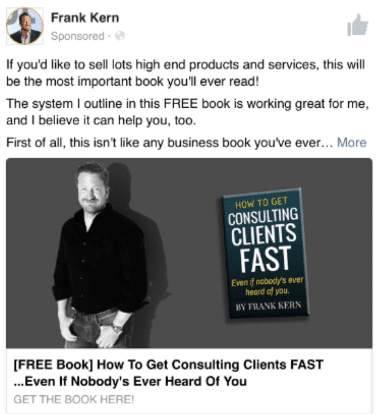
FREE is Very Powerful
Even though people may suspect in the back of their minds that they have to pay something, the word “free” is still compelling.
More Blending
Frank standing in the picture creates trust: he’s just like anyone else in your Facebook feed!
And the book creates a sense of credibility.
Ad #5: Russell Brunson Is Retargeting You
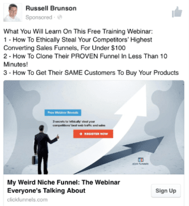
Retargeting: An Advanced Marketing Tactic
This is an example of a retargeting ad, which you won’t see this unless you’ve visited one of Russell Brunson’s landing pages already.
Most people who visit one of your landing pages will leave without opting in. So an ad like this can try to reach those people who had a little bit of interest but weren’t completely convinced.
They're Interested – Give Them More Benefits
The “3 reasons” format is great for retargeting.
You know your prospect is at least somewhat interested, so instead of focusing too much on the offer, you’re outlining the main benefits your reader will experience if they take action.
Ad #6: Yanik Silver Tries Something New
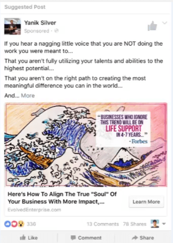
You Gotta Know The Rules To Break Them
First off, you’ll notice that the image isn’t of a person, a book, or even an animated person. Instead, it’s a relatively famous piece of art.
Yanik’s team chose this image in order to stand out, and the image fits in very well with the copy.
Make Your Copy Speak To Someone's Identity
The copy is directly speaking to the type of people who tend to invest in themselves and create high performing businesses.
Notice the phrases: “Do you hear a voice saying you’re not doing the work you are meant to do? That you aren’t hitting your full potential?
That you aren’t making the most meaningful difference in the world?”
This copy fits in with the image to appeal to the emotions and identity of the reader.
Forbes for Credibility and Another Cliffhanger
In order to get some credibility, the ad uses a quote from Forbes, which is obviously a very well known and respected source.
And again, we see the classic “and…” cliffhanger.
If your prospect has already read the first few lines of the copy, it’s very tough for them to resist clicking “learn more”.
Here we can see the long form copy of the ad:
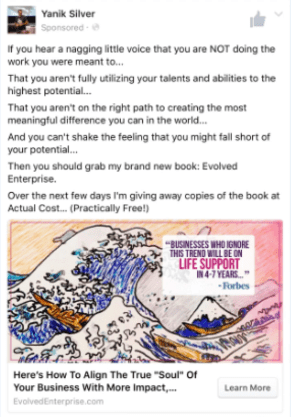
Write For Emotional Impact
Humans take action based on feelings, not rationality, which makes the line “you can’t shake the feeling” super powerful.
If you want to learn more about this, check out the book “Predictably Irrational” by Dan Ariely.
Know Your Niche
He’s not doing free plus shipping, because that format is so popular in the internet marketing niche.
He’s doing “buy at cost, practically free” hoping to get our defenses down a bit, because we all know with the free plus shipping model there’s a upsell on the other side.
You have to know your niche and alter your copy and offer accordingly.
Capturing An Email Address Is Usually The Main Goal
Successful Facebook ads usually work by sending your traffic to a landing page, where you will offer a lead magnet in exchange for the visitor's email address.
This gets them on your email list, and gives you the best chance of turning them into a customer in the future.
Of course, if you have a great ad campaign in place, you can create a self-liquidating funnel by selling one-time offers and one-click upsells further down the funnel to liquidate your ad spend.
Split Testing Facebook Ads Is Crucial
The best Facebook ads in existence made it to the top because they were ceaselessly split-tested.
This is not something you can afford to compromise on.
You can transform a new Facebook ad from good, to great, by split testing. This can be done with carousel ads, a video ad, or really any kind of social media ads.
Basically, you test different elements of your Facebook ad (again, you can do this with any sort of ad, including carousel ads, a video ad, long-form sales copy, etc.), and see which elements give you the best results.
Then, you test those elements against new elements, etc. and you never stop!
Conclusion
If you’ve found yourself losing hope with Facebook ads (as a lot of people do), I encourage you not to get discouraged.
Instead, take some time to dissect these Facebook ad examples, because learning how to study great marketers is going to shortcut you to writing Facebook ads that do a great job of displaying your offer and raking in profits!
Don’t waste years on trial and error. Instead, just implement what’s working already in great ad examples that are already being utilized by the pros.
I want you to crack the code on your best Facebook ads campaign once and for all, and make it profitable for you asap!
Let me know how these examples work for you. Leave a comment if you need help. I love to help, so hit me up and let’s connect!
Also if you want a deeper understanding of how I generated 13,943 leads & 188 customers for $888.88 with Facebook Advertising, click here and watch my free presentation.