
Imagine putting your heart and soul into designing your sales page but getting absolutely no results in return….
How does it feel? Pretty devastating, right?
You pay to run ads to your marketing funnel and it’s all working beautifully. Your audience FREAKiNG LOVES your lead magnet, and you’re getting between 10 and 50 leads every single day…
But you notice something.
No one bought your product on day 1…
In fact, no one your product on day 2 either… Or day 3 or day 4…
Not a single person found your sales page compelling enough to buy your offer.
Now you’re stuck there with ads to pay for and a sale page that doesn’t convert.
That’s enough to make you run scared from building your online business.
But the solution is simple… maybe it’s time to change your methodology.
A sales page is the best opportunity to describe your products and/or services to the audience. You can use this opportunity to make them WANT to buy whatever you’re selling.
If your sales page is not optimized for conversions, you’re losing boatloads of money.
Here’s another piece of bad news: Your marketing and advertising budget is also going to get wasted.
Would you like to know the secrets of creating a top-performing sales page to funnel a consistent stream of income directly into your bank account?
That’s what you’re going to learn in this blog post.

Whether you’re struggling to get enough conversions on your sales page or just want to squeeze more $$$ from your existing customers, this post will get you covered.
In this blog, you'll learn 11 simple steps on how to create sales pages that convert like crazy....Every. Single. Time!
Unlike what many ‘professional’ software companies tell you, designing a sales page doesn’t have to be a complex process. You don’t have to spend weeks or even days to create high converting sales pages.
Not anymore.
Because we’ve found a solution that makes it incredibly easy and fast for you.
Just follow our step by step guide and your high-performing sales landing page content will be ready within no time.
No kidding!
Now let's get started.
What Are The Components Of A High-Converting Sales Page?
A sales page is an individual web page on your website that’s made with just one objective in mind: to convert sales for your product or service.
The product or service you’re selling on your sales page can vary depending on your industry or niche. Yet, the objective of your sales page content remains the same….
…..encouraging mere visitors to transform into paying customers.
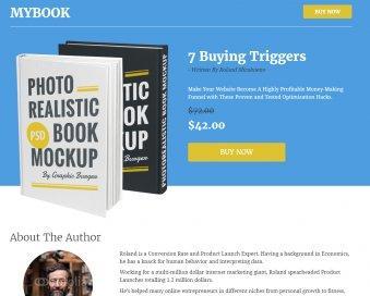
Here's an example of a sales landing page promoting Ramit Sethi’s "Find Your Dream Job" guide:
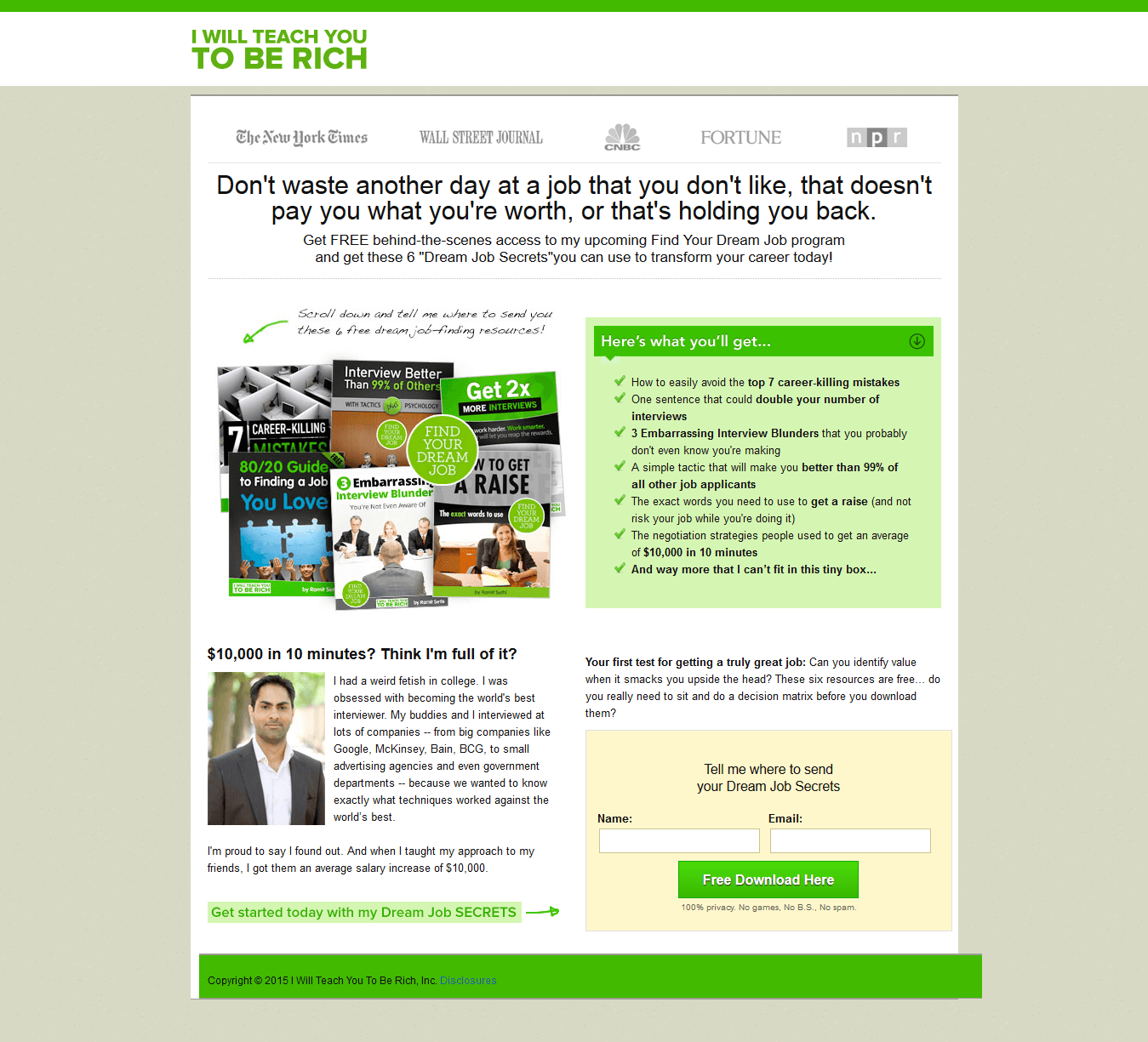
There are many components to a high-converting sales page. For most sales pages, you will need…
- The Headline
- The ‘Call to Action’
- A Video
- Third-party verification
- Reviews
- And copy
Speaking of copy, one of the most asked questions I get about sales pages is ‘how much copy do you need?’
How long does a sales page actually need to be?
Here’s what you need to know to create a sales page that converts.
How Long Should A Sales Page Be?
There's no magic number.
Your sales pages can be either Long-form or Short-form.
In terms of design, both kinds of sales pages are quite similar in terms of content.
Long Form Sales Pages And Short Form Sales Pages Are Still Fundamentally Similar
Both include a description of your product or service that your customer reads and determines whether or not they want to click on your call-to-action (CTA) button.
So, what makes them different?
The only dissimilarity between a long-form and a short-form sales page is the actual length of the page.
Which One Should You Choose?

This depends on your offer.
I recommend a long-form sales page ONLY if you know how to strike the right balance of copy and design elements within the content on the page.
Else, it can end up going haywire and get pretty confusing, resulting in pushing your potential customer away from doing business.
When To Opt For A Long-Form Sales Page
Opt for a long-form sales page when:
- Your product/service is costly
- Your product/service is intricate and needs more copy to explicate its value to the people you are trying to sell to
- Your product/service needs a high commitment from your audience for conversions
- You have a comparatively new product/service and you want to inform your potential customer about it
In short, a long-form online sales page works best for your business when your offer has a higher price tag and needs a high commitment from your potential online customers.
When To Opt For A Short Form Sales Page
A long-form page is definitely not a good choice for offers such as boxes of chocolate, bicycle helmets, or smaller-ticket items that cost less than $50.
So, it depends on what you are trying to sell to people. A $2,000 webinar will certainly require longer-form copy, and probably a video sales letter as well.
11 Steps To Create Sales Pages That Convert
Not sure how to create sales pages that convert like crazy? Well, to help you out, I've compiled a few steps to help you get started creating successful sales pages.
1. Headline
The first step is to have an interesting and attention-grabbing headline on your sales landing pages.
Your headline should clearly illustrate what you want to convey to your target audience. It should also strike an emotional cord with them, letting them know that this is the solution to the problem they’ve been looking for.
People Want Solutions
They want to learn or buy what is needed to take them to their next level. And your job with your headline is to show them that this is it.
For Best Results, Keep It Brief
The simpler you can make it, the better.
Use emotional impact words that will resonate with what your audience is looking for. For example, in the dating sector, you might use words like “win dates with hotter women today,” as this kind of language will really catch the eye of your target customer.
2. Copy
Your sales page copy is the real star of your page, so you need to focus the most on this element if you want high converting sales.
This isn't like a brief social media post. This needs to be pretty specific, and may need to get in-depth to really create conversions.
If Your Copy Is Boring Or Not Relevant To Your Target Market, There’s Absolutely No Use Of Creating A Sales Page In The First Place
Usually a successful sales page is extensive, so your copy must be broken down into smaller sections and sentences to improve readability.
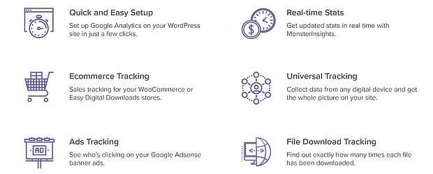
Here’s a quick tip: Organize your copy in short paragraphs and bullet points wherever possible.
See how MonsterInsights has used bullet points to showcase their key features.
Avoid fluff or fancy vocab. Your ultimate goal is to boost sales for your product… not prepare your visitors for a GRE exam. Use words that are simple to understand, yet effective in conveying your actual message.
You can also differentiate your copy from other page or headline elements by putting quotes in special boxes.
Here Are Some Other Sales Copy Tips To Keep In Mind…
- Cut out anything needless. Even if your copy is long-form, only include relevant information
- Keep it relevant. You might really like that paragraph you wrote… but is it absolutely needed on your sales page? If it isn’t 100% relevant, pitch it.
- Your copy should include as many emotional statements as possible. Emotion is what sells. If your copy is too ‘logical,’ you might rationalize people right out of buying!
- Strive to use your copy to describe how this product is going to solve the problem. That’s the whole game. If this product isn’t solving a problem, people will never buy it.
3. Call To Action (CTA) Button
Ideally, there should be several CTA buttons on your sales pages.
Don’t expect people to scroll all the way down to find your main CTA button after they’re done reading everything on your sales page.
So put numerous CTA buttons all through your sales pages so that the visitors can just click on it wherever they feel the most persuaded.
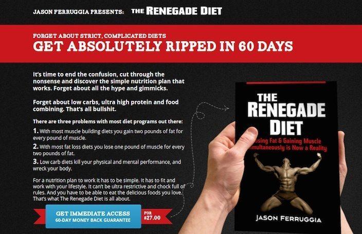
Also, Focus On The Aesthetics Of Your CTA Button
Use a distinct color and write actionable copy on it. Ditch the ‘Buy Now’ or 'Subscribe Now' button. Instead, write something creative and different!
Check out the way Renegade Diet has personalized their CTA button.
This is all about creating sales for your business, and works together with your headline and content. You may have to learn how to create the perfect sales page, but that's ok. Practice makes perfect.
4. About Us
It is recommended that you create an 'About Us' section on your sales page. This will help increase reliability and make your offer appear more humanistic and social. Add a brief story on how you started and what your mission is.
It's a great opportunity to strike a chord with your website visitors.
With the right storytelling, you can make your customers fall in love with you and your company!
Here's an example of an About Us section on a sales page.
5. Customer Testimonials/Social Proof
Also include testimonials from your previous buyers to guarantee your visitors that the product or service they’re about to buy has already proven beneficial to others.
Show off how your past customers love your offer. This will encourage new customers to share their hard-earned money with you.
This is also true for client badges and logos of businesses that have purchased and used your product/service.

All this adds a social proof to your sales page, and helps in creating assurance for the visitor regarding their purchase.
6. Video Demo
If you’re selling a product, it is recommended that you create a video demonstrating how it works. The same goes for services.
It’s a great way to capture attention. Plus, it helps your visitor imagine what a product actually looks like before they hit the ‘buy now’ button.
See this example where Live Off Your Passion have embedded a short video explaining their service.

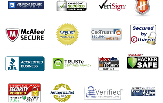
7. Trust Seals
This is especially true for e-commerce sales pages where shopping cart abandonment is a plaguing issue.
Your buyers, especially those who are doing business with you for the very first time, are not sure about the payment security. Naturally, they are hesitant to enter their payment info.
A Great Way To Tackle This Issue Is To Place Trust Seals On Your Sales Page
A trust seal is an icon placed on your sales page that guarantees your visitors that the page is genuine and that all their info is gathered via secure 3rd party service providers.
These trust seals make you look authentic and add an air of professionalism.
Take a look at this example:
8. Eliminate Navigation Links
This is one common mistake you'll see on thousands of sales pages. Just like a post-click landing page, your sales page should not have any navigation links.
Why?
Because when you spend loads of time designing and crafting copy for your sales page, you certainly don’t want to provide options for visitors to leave.
9. White Space
Your sales page shouldn't be all text and image. Instead, there should be plenty of white space to improve readability.
The white space helps you maintain a subtle balance of design elements on your sales page.
Not Sure How It Benefits You? Take A Look At This Sales Page Sample:
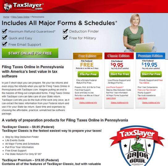
Can you see at a glance what this page is about? You probably can't... which is not surprising!
This is because the page is simply too cluttered to sell. There's A LOT of text, and there's hardly anything remarkable that stands out.
And, look at their call to action buttons. What are you supposed to do? Start online for free, or file for free, or start for free.
Honestly, you really don't know because there are 4 different places for you to start.
So confusing and unappealing!
By adding ample white space, you give every page element a chance to shine. Take a look at this sales page, and you'll see that it makes a difference. Your business will benefit from a nice, clean look.
10. Responsive Design
A quick fact-check: Today, the number of smartphone users all over the world surpasses 3 billion. And this figure is forecasted to further grow by several hundred million in the next few years.
Why is this important?
Because you need to leverage this opportunity and reach out to such a massive audience via their mobile devices.
Nearly 60% of holiday shopping traffic and 42% of holiday purchases come from these mobile devices. So you’ve got to ensure that your sales page still works on small device screens.
This is where responsive design comes in.
It helps you ensure that your page resizes, while still crushing it, regardless of what size screen your audience is using.
You want to make sure that your sales page is formatted to look great on any type of screen… be it a desktop monitor, a cell phone screen, or even on a tablet.
11. FAQs
Another great tactic is to add a FAQ section which addresses fears, uncertainties, and doubts among your potential customers.
Now, you don't have to answer every single question. Just add a few questions that are most common.
Address topics that can hinder you in converting sales.
See how the MonsterInsights sales page handles potential issues:
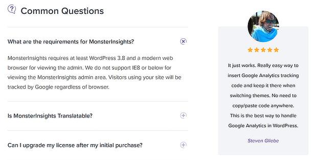
The best way to identify common problems and queries is to check with your customer service and support teams. They can help you identify key questions that you can address on your sales page.
Here's a great tip you may consider when developing your FAQ section...
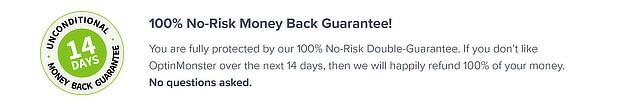
What do customers worry about the most when buying a new product or service?
Tackle this issue by highlighting a money back guarantee if you're selling digital products. Similarly, if you're selling physical products, mention a user-friendly returns policy to put this fear away.
Here's an example from OptinMonster landing page:
How Do You Write Killer Sales Copy?
So you know all the important steps to create sales pages that skyrocket your conversion rates. But one step that needs the most attention is your sales copy.
Why? Because it has a make-it-or-break-it effect on your conversion rate.
Here are some actionable tips on how to write a sales copy that can help you in converting sales.
Keep Your Buyer Persona In Mind

It's just not possible to write good sales copy without knowing clearly who you’re talking to.
This is why before you start writing copy for your sales pages, you need to understand who your target audience is and what their requirements are. This will help you understand what factors they consider when purchasing your offer.
How do you do so?
Create A Customer Avatar Or Buyer Persona!
This is a fictional personality representing your ideal customer.
Although your buyer persona may be fictional, it should be based on actual data gathered via customer surveys, website and social media analytics, and other online research methods.
With a buyer persona in mind, you can better understand your potential customer’s influences, pain points, problems, and enticements. Use this info to create sales copy that addresses each of these factors and clearly species the audience you’re targeting.
Generate a USP
Your USP is a Unique Selling Proposition that mentions the key benefits your offer provides, and the problem you can resolve for your customer. Plus, it also highlights why you’re the best person to do so.
Ideally, it should be a one-line statement or a short phrase that guides the rest of your copy.
According to Steve Blank, your USP should be something like... We help X in Y by doing Z.
For example, if you're an email marketing software company, your USP could be...
We help companies and entrepreneurs in building their email lists and converting sales by offering robust email marketing software.
Set The Right Price
Before you start writing your sales copy, determine the cost of your product or service. After all, price is one of the most important sticking points for many potential customers.
Set a price that justifies the value your offer can add to your potential buyer's life.
Here Are Some Of The Tried And Tested Pricing Tips That You Can Try:
- Use price anchoring and offer more than one price point. For example, mention three different price points and people will be more likely to take the middle one. Why? Because it looks like better value.
- Label every price point with a descriptive name so that users can easily self-select. For example, web-only subscription for $59 and web+print-only subscription for $119.
- For maximum benefits, ensure that your price ends with the digit '9'. Studies suggest that more people are attracted towards this charm pricing. See how WordPress Forms follows this tactic:
Describe The Product/Service And Its Benefits
Your sales copy should obviously explain your product or service in detail. But, you need to understand the principle of features versus benefits.
Remember, your customers are more concerned about what your offer will do for them, instead of what fancy features it has.
So The Rule Of Thumb Is To Focus More On Benefits Than Features!
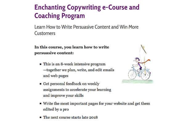
Use bullet points to mention all the benefits that your product/service has to offer. See how Enchanting Marketing has done it:
Want to go one step further? Highlight the benefit of the benefit.
For instance, if you're selling nutritional supplements, the benefit is good health, but the benefit of the benefit could be that you’ll look younger.
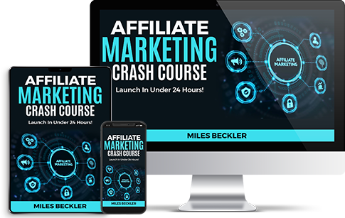
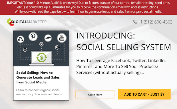
Here's an example of how this strategy is used on a page promoting a free training.
See how this page not only shows the benefit of the free training, but it also highlights how that training will impact customers' businesses.
Wrap Up
When it comes to designing sales pages that convert like crazy, less is definitely more...
You don't need to add loads of text, interactive design elements, or fancy images. Keep it simple and easy to understand.
Avoid using any technical jargon and navigational elements if you really want to convert visitors into paying customers.
In this article, you learned a lot of tips on creating sales pages that actually convert and generate sales. From crafting a killer headline, to using ample white space, to adding multiple CTA buttons, you covered nearly every aspect of an effective sales page design.
Lastly, you also had a look at some great tips on how to create a high-converting sales copy.
For a high-performing sales page, the copy and the design go hand in hand.
If you really want people to focus on your sales copy and actually read it from start to finish, you gotta use design to help them.
What does that mean?
Just remove any distractions from the main goal of your sales page: to encourage visitors to click on your CTA button and convert by making a purchase.
Some of the very best sales pages have no sidebars. Plus, they often have minimal headers and footers, or none at all.
And I'm talking about multimillion dollar businesses and obviously these pages convert like crazy.
Everything that is on their sales page is relevant to what the business is trying to sell. No jibber jabber!
Also… Don’t forget, if you’re really hungry to crack the code for building ‘online income’, my free course reveals the 7 step process that took me from $50,000 in student loan debt to a million dollar business online, make sure you grab a copy now!